barzii.design
Landing Page Analysis
Passionate freelance Product / UX designer specializing in user-centered experiences - wireframing, prototyping, design and testing.
Summary:
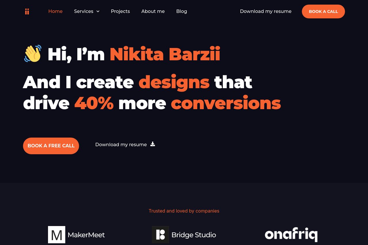
The landing page is quite powerful in communicating the brand message, yet there are critical areas that need attention. The value proposition is loud and clear with promises of driving more conversions, which is perfect for recruiting agencies. However, the visual clutter and text-heavy sections can tire the reader. The design and color scheme align well, but the call to actions are not as distinct as they should be, getting lost in the sea of text at times. The lack of images in the case studies section makes it lack visual appeal and credibility. Credibility is supported with logos, but more personalized elements could enhance trust. In terms of readability, the text is somewhat dense in places and could benefit from more spacing and visual breaks.
- Simplify text blocks by breaking them into bullet points or shorter sentences for better readability.
- Enhance the call to action buttons by altering color or size to stand out more effectively.
- Add real images or snapshots to the case studies section to increase engagement and trust.