vercel.app
Landing Page Analysis
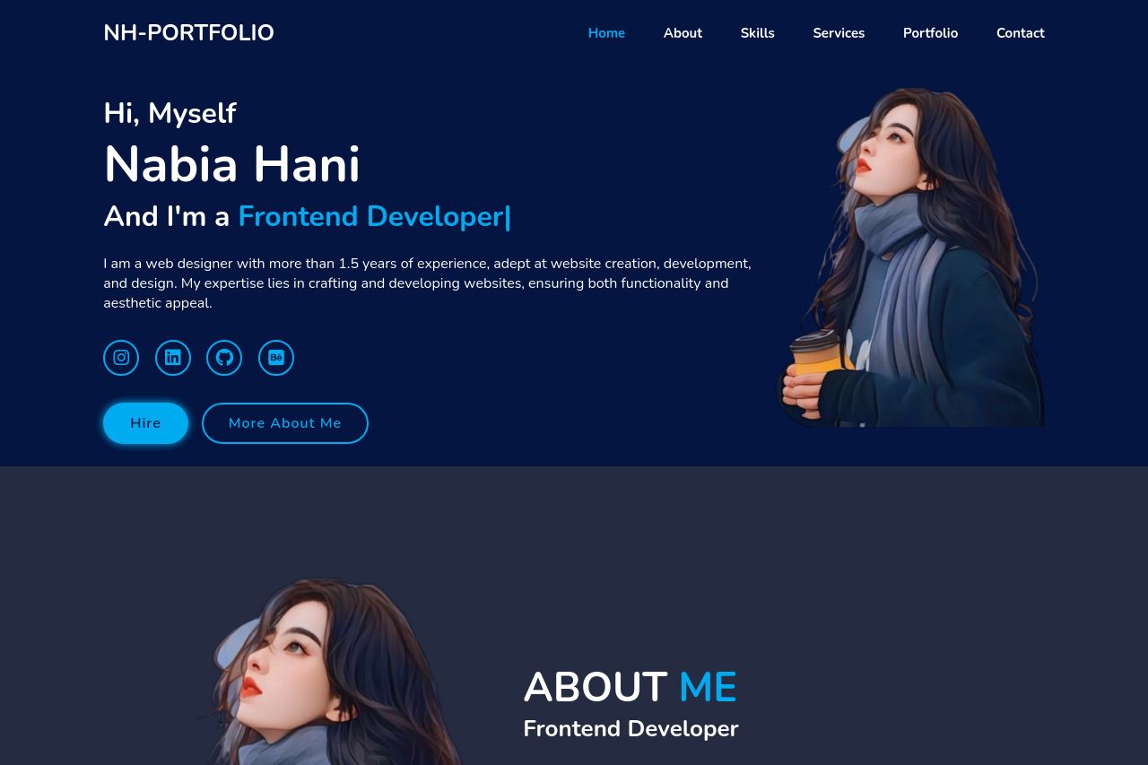
I am a web designer with more than 1.5 years of experience, adept at website creation, development, and design. My expertise lies in crafting and developing
Summary:
The landing page attempts a sleek and modern look, with a consistent color scheme throughout. The use of dark and vibrant blues aligns well with the audience looking for professional web design services. The structure is straightforward, with sections logically leading from one to another, such as About, Skills, and Services.
However, the opening statement, "Hi, Myself Nabia Hani," sounds informal for a professional portfolio. The text could be less verbose, especially in the services section, where wordiness distracts from the main message. Additionally, the CTAs are not very prominent or varied, which may affect the actionability negatively. The testimonial or project section is absent, missing an opportunity for social proof.
The typography is legible, but the paragraphs could use better spacing to improve readability. Overall, it's a promising start but needs refining for clarity, focus, and persuasive elements.
- Revise the opening statement to sound more professional. E.g., 'Hello, I'm Nabia Hani.'
- Simplify the service descriptions to enhance clarity and impact.
- Make the CTAs more prominent and varied with clear action verbs.