vercel.app
Landing Page Analysis
Web site created using create-react-app
Summary:
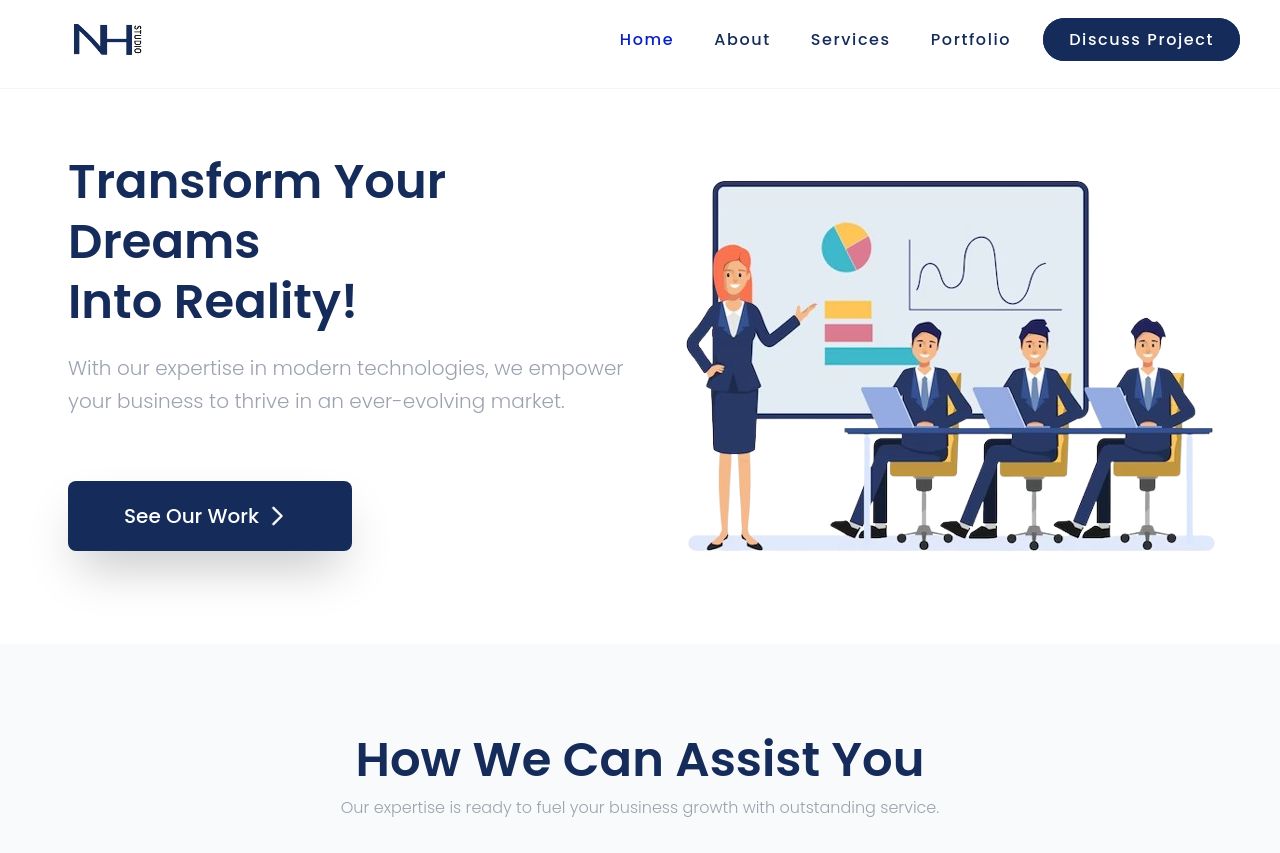
The overall layout of the page is clean and visually appealing, with a pleasant color scheme and appropriate use of whitespace. However, it lacks a strong, compelling call-to-action that grabs attention. The messaging is somewhat generic, with buzzwords like "empower" and "thrive" not really standing out or being particularly meaningful. The hero section attempts to convey a strong value proposition but falls short as it doesn't clearly communicate the benefits or reasons to choose the services. The imagery supports the content but doesn't enhance the storytelling or understanding in a significant way. Contact information and services are visible, but there's a lack of immediate transparency about the company's credibility and offerings. The navigation is straightforward, but some sections of content feel slightly repetitive, making the user journey longer than necessary.
- Clarify the unique value proposition in the hero section by specifying what sets your services apart.
- Add more engaging CTAs with action-oriented text that encourages users to take the next step.
- Incorporate stronger social proof elements, such as more testimonials or recognizable client logos.