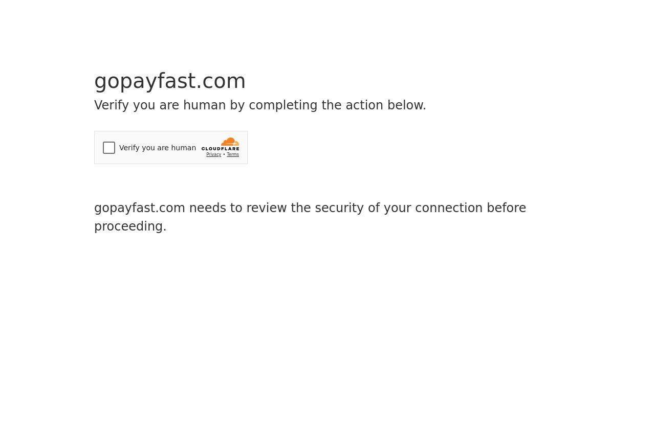
gopayfast.com
Landing Page Analysis
Verify you are human by completing the action below.
13

Share on:
Summary:
0
Messaging
40
Readability
10
Structure
10
Actionability
15
Design
0
Credibility
The page you're looking at isn't even a real landing page! Instead, it's a generic verification screen by Cloudflare, which is not exactly inspiring confidence for users who want to access gopayfast.com. This setup might be functional from a security standpoint, but from a user experience angle, it's a disaster. There's no messaging about the actual service, no design elements, and no clear call to action beyond a checkbox. It lacks any compelling reason for users to stick around, and there's absolutely no information about what gopayfast.com actually does.
Main Recommendations:
- Ensure that users can access the website without getting stuck on security checks.
- Provide immediate information about gopayfast.com's services to retain user interest.
- Improve user experience by reducing barriers like verification screens unless absolutely necessary.