korelirenaultcikmaparca.com
Landing Page Analysis
Koreli Renault Orjinal Çıkma Parça-yıldız sanayi Ostim Ankara
Summary:
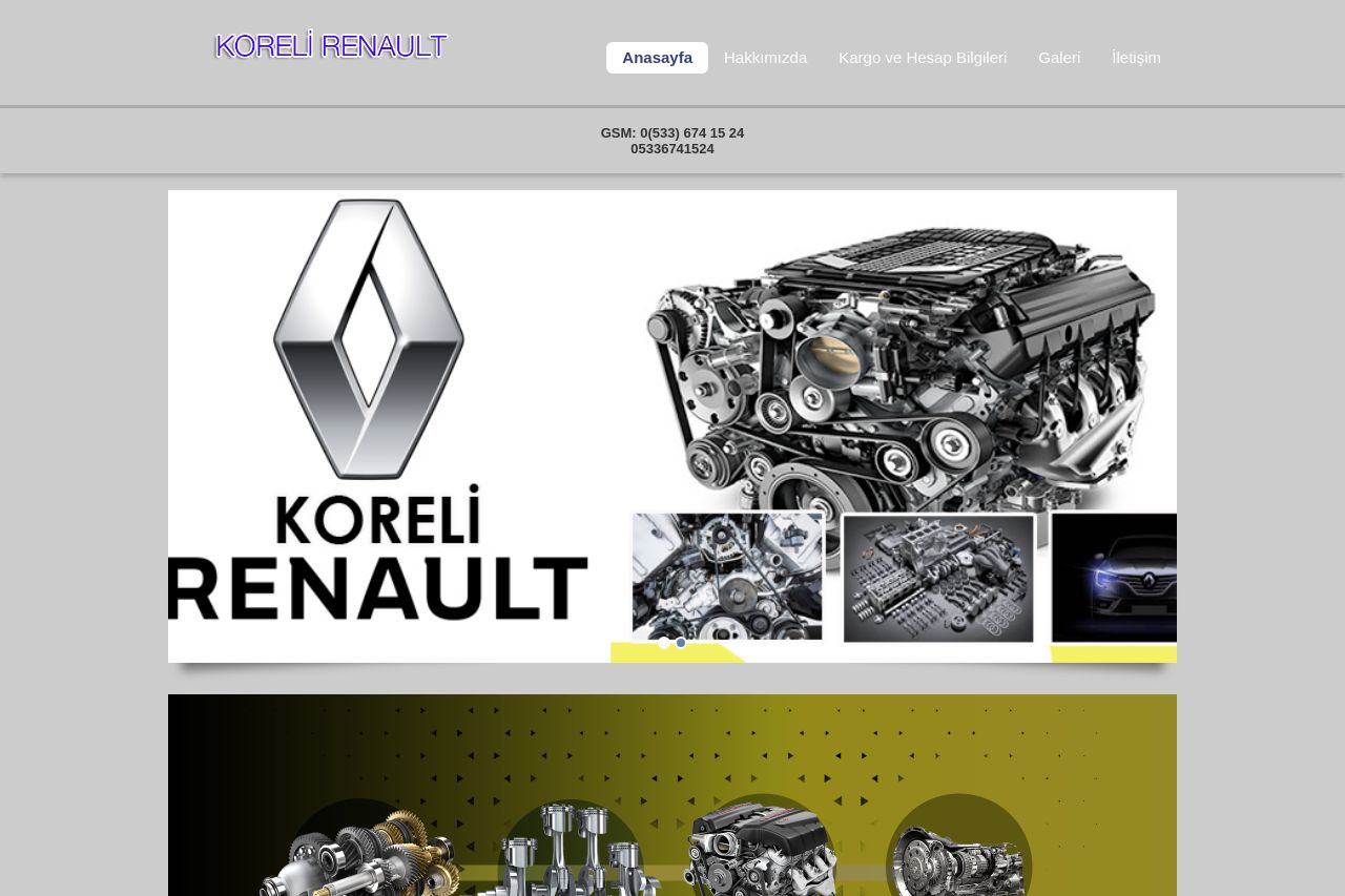
The landing page for Koreli Renault is overcrowded with imagery that looks repetitive and unorganized, making it challenging to focus on crucial information. The visual hierarchy is lacking, causing important content to blend into a sea of images with some cluttered presentation. Typography is decent, but there's no effort in making the headings or key messages stand out with varied font sizes or colors. The layout follows a very basic and uninspiring template.
The Call to Action elements like the phone number and WhatsApp button are clear and directly encourage engagement, but the rest of the page doesn’t guide the viewer effectively towards them. Social proof or trust elements are absent; this greatly affects credibility.
Messaging doesn't effectively capture what the company offers; the text seems directly translated, with no clear explanation of benefits. There's a lack of content that resonates with a target audience, and the design and visuals don't help with understanding. The overall look is outdated and does not reflect professionalism.
- Enhance visual hierarchy using contrasting colors and varied font sizes.
- Clearly define and prominently place the main value proposition.
- Add social proof elements like testimonials or logos to build trust.
- Reduce the clutter by organizing images and adding descriptive text.
- Improve the CTA's visibility and actionability.