com.pk
Landing Page Analysis
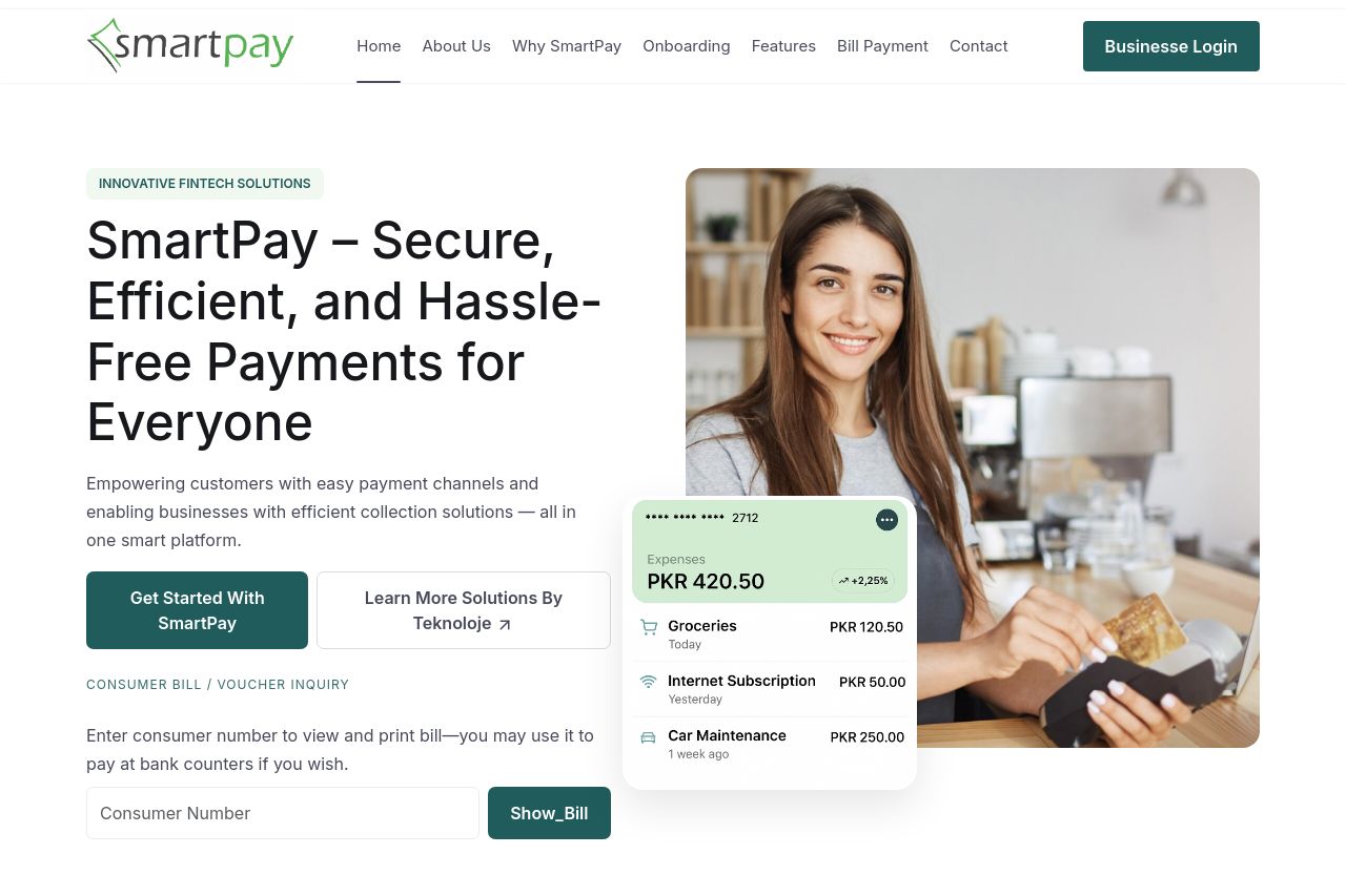
Empowering customers with easy payment channels and enabling businesses with efficient collection solutions — all in one smart platform.

Summary:
SmartPay's landing page offers a clear, professional look with a consistent color scheme tailored for its audience of businesses and billing pathways. The messaging clearly focuses on efficiency and comprehensive payment solutions, which suits the target audience well. However, some of the content comes off as generic, and several critical components like an explainer video are mere placeholders. The CTAs are clear but could be more strategically placed throughout the page. Social proof is strong, with customer testimonials offering credibility. Visibility of key elements like the Onboarding section could use some work to make the processes more apparent.
- Replace placeholder images and videos with actual content to enhance credibility.
- Improve the CTA placements to ensure they align with the user journey across more sections.
- Consider shortening some of the content to enhance readability without missing key information.