mysuperbutler.com
Landing Page Analysis
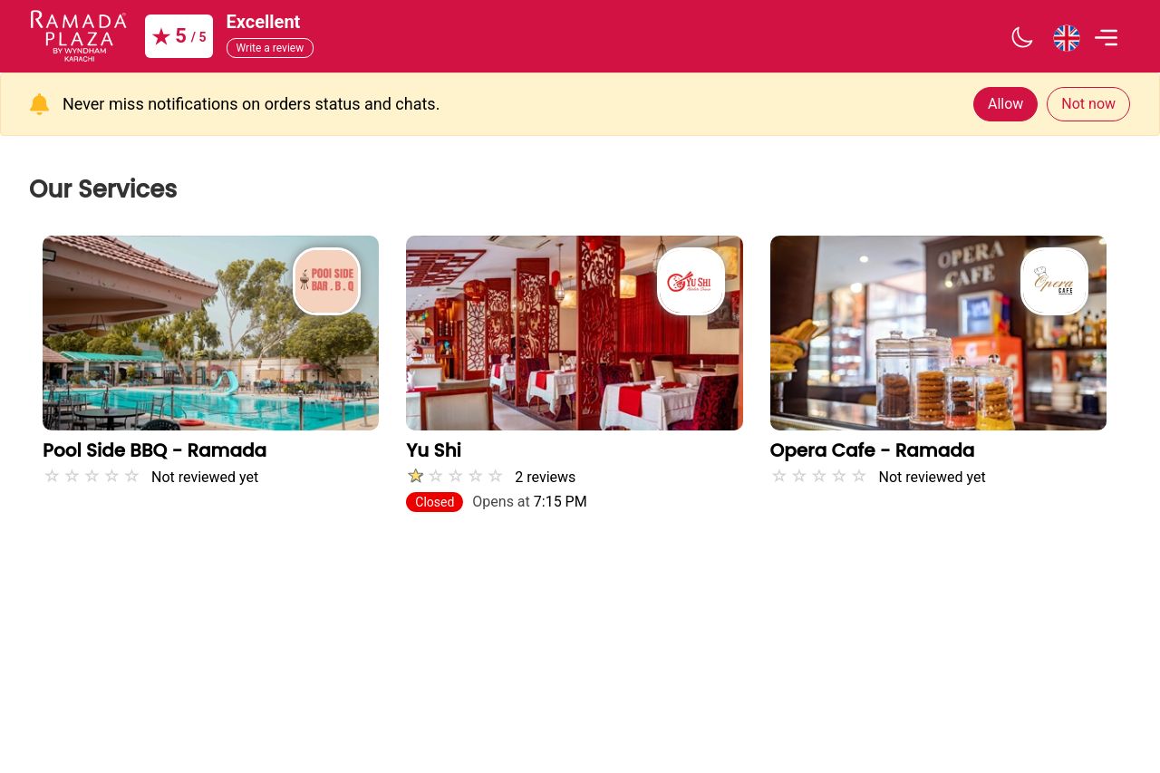
Treat yourself to a luxurious experience and conveniently access a range of services by simply scanning a QR code.
56
Generated on:
August 11, 2025Score:
56/100Audience:
B2CShare on:
Summary:
30
Messaging
75
Readability
50
Structure
50
Actionability
65
Design
50
Credibility
The page boasts a clean design, featuring nice use of imagery to showcase services. However, there's a lack of engaging and clear call-to-action elements. The main value propositions are not immediately obvious, leaving potential customers unsure of what the benefits are. While the design is visually appealing, it risks failing to guide the user towards conversion steps effectively due to an unclear message and weak CTAs.
Main Recommendations:
- Improve clarity of the call-to-action by specifying the next steps users should take, like 'Explore Our Services' or 'Book Now'.
- Enhance the value proposition and make it clear what makes the services unique or appealing.
- Use more engaging language in the descriptions to better target potential customers, focusing on benefits.