caringvillage.com
Landing Page Analysis
Discover essential caregiver support: Access free resources and assistance for seniors. Find the help you need to provide the best care. Learn more today!
Summary:
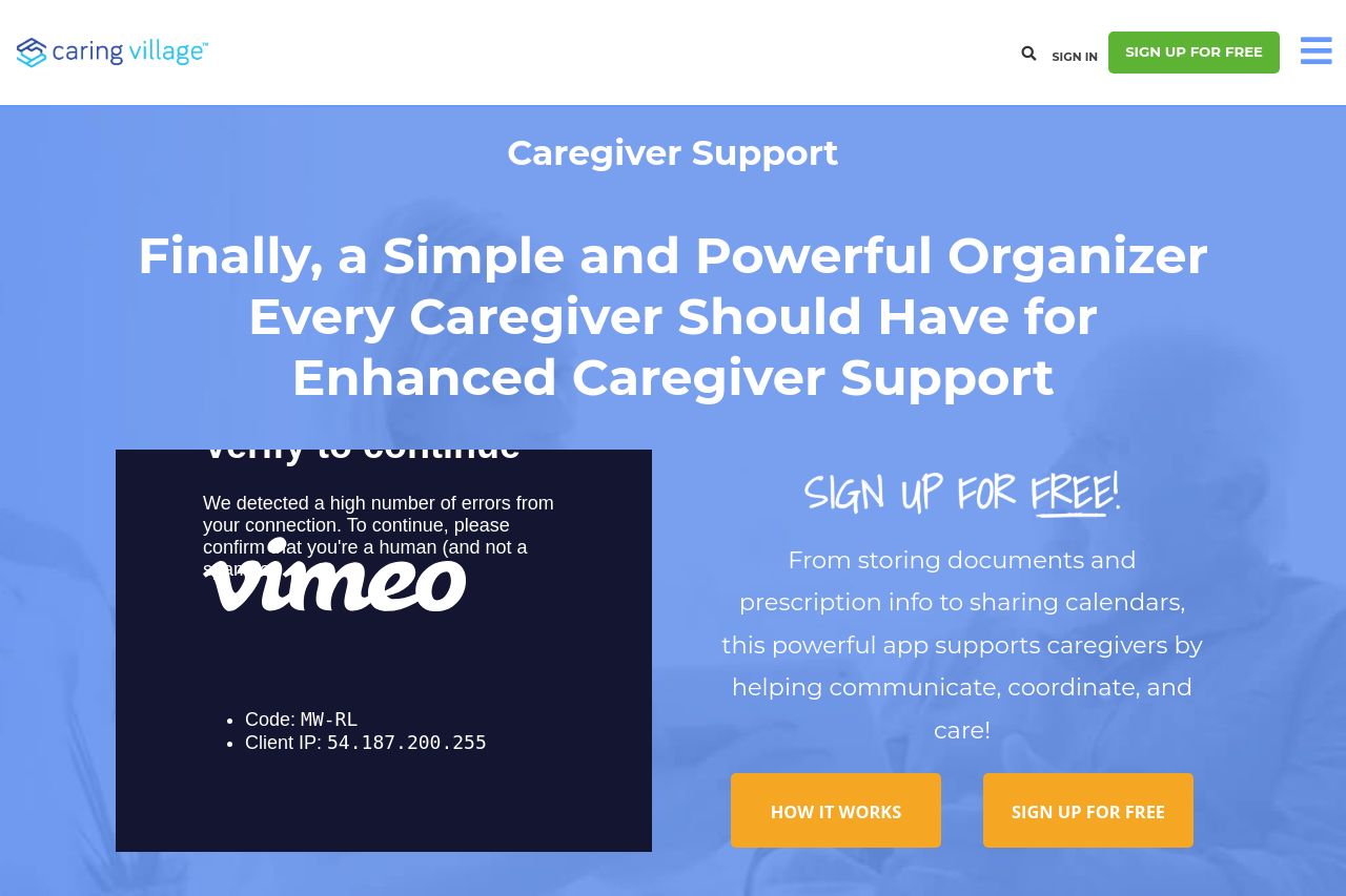
The landing page of Caring Village is visually decent but lacks strong engagement. The value proposition is tucked away in well-intentioned but overly wordy headlines, making engagement more challenging. While the target audience is clearly caregivers, the messaging doesn’t zone in effectively, making the content feel more generic.
The structure is logical, providing a clear path for visitors to explore caregiving resources. However, it lacks emphasis on priority actions, resulting in missed opportunities for conversions. The CTAs, albeit present, lack pop and urgency, reducing their compelling nature.
The design is consistent in color and typography, but the visual hierarchy doesn't direct attention efficiently due to the lack of contrast and emphasis. This affects not just engagement but also readability.
Despite featuring some client logos and reviews to build trust, the overall credibility requires more emphasis. Trust elements need to feel more substantial. Overall, the website offers a resourceful and organized experience but doesn't capture interest quickly enough or steer it effectively toward conversion.
- Add more dynamic CTAs and make them stand out.
- Refine messaging to better address specific caregiver challenges.
- Increase visual contrast for better readability and engagement.