talkpro.in
Landing Page Analysis
Username or email *
Summary:
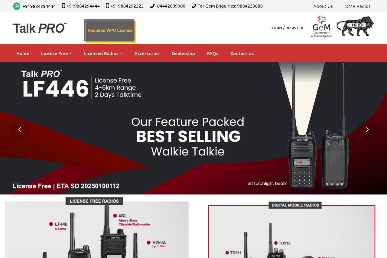
The landing page for TalkPRO focuses on marketing their walkie talkies with clear mention of their features and uses. The design follows a consistent color scheme and layout, which provides a professional look but lacks unique branding elements that stand out. Product information is prominently displayed, but some key messaging elements are buried under excessive text and visuals. The use of testimonials and client logos adds an element of credibility, though more specific and engaging CTAs could improve actionability.
Visuals are good but slightly cluttered with text-heavy sections that hinder readability. There's a decent balance of text and images, but the hierarchies could use refining for a more streamlined user experience. Some sections blend into one another without clear distinction, making navigation less intuitive.
Messaging is informative but lacks a compelling hook that directly addresses the user’s pain points or desires. While the tone seems appropriate for its target audience, more dynamic and varied language could enhance engagement.
- Simplify and refine the text in some sections to enhance readability.
- Improve CTA positioning and clarity to drive conversion.
- Refine the visual hierarchy for better navigation through content.