greenlighteld.com
Landing Page Analysis
August Offer:
Summary:
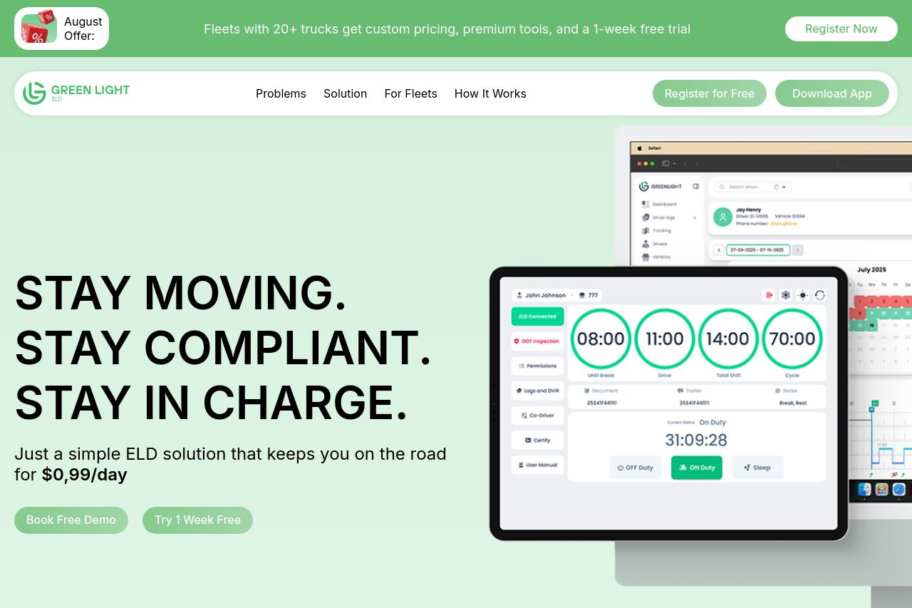
The landing page for Green Light ELD is almost hitting the mark but falls short in some crucial areas. The design is clean, and there’s an attempt at an engaging value proposition with phrases like "Stay Moving. Stay Compliant. Stay In Charge." However, this hook lacks depth and repetition to fully reinforce the message.
There's a visible effort to communicate benefits, with sections like "Easy Interface That Helps Instead of Confusing," but the messaging doesn't consistently resonate with the target audience. The tone tries to be professional but sometimes feels detached.
Readability suffers due to overly lengthy text blocks, though the typography is straightforward enough to not detract from the message. Visual clarity is decent, with good use of contrasting CTAs and imagery.
While structure and actionability are fairly logical, some CTAs are repetitive without adding value. Credibility is solid, thanks to trust badges and testimonials, yet missing a bit more detailed social proof like prominent client logos.
Overall, it's a good attempt but harshly speaking, the messaging and structure need more fine-tuning to leave an impactful impression.
- Revamp the value proposition to be more engaging and impactful.
- Use storytelling elements to align more with the specific needs of your target audience.
- Simplify text blocks to enhance readability and engagement.