workplacesage.com
Landing Page Analysis
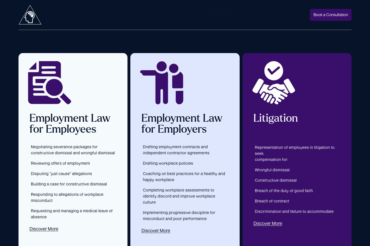
Explore the range of employment law services for both employees and employers offered by Workplace Sage Legal.
Summary:
The page manages to maintain a clean and professional look, aligning with the seriousness of legal services.
The segmentation of services into employees, employers, and litigation is straightforward, ensuring users can quickly locate the type of service they need. However, the layout is visually bland, and there is a lack of engaging elements or visual stimuli to capture attention. The CTA "Discover More" is quite generic and doesn't prompt immediate action. The overall color scheme feels monotonous, lacking contrast that might help important elements stand out. On the credibility front, the footer includes essential contact details and social media links, which is a good touch, though there are no trust badges or testimonials to strengthen credibility further.
The information is presented clearly, but the copy could use more dynamism and persuasion. The current format might not motivate users to explore further or book a consultation. The text is easy to read, but the paragraphs could be broken up more for better skimming. Typography is consistent but lacks emphasis on key information. Overall, the page needs enhancements in motivational phrasing and design creativity to elevate user engagement and conversion potential.
- Add more engaging CTAs with specific actions.
- Introduce testimonials or client logos for credibility.
- Enhance color contrast to make key sections stand out.