goniyo.com
Landing Page Analysis
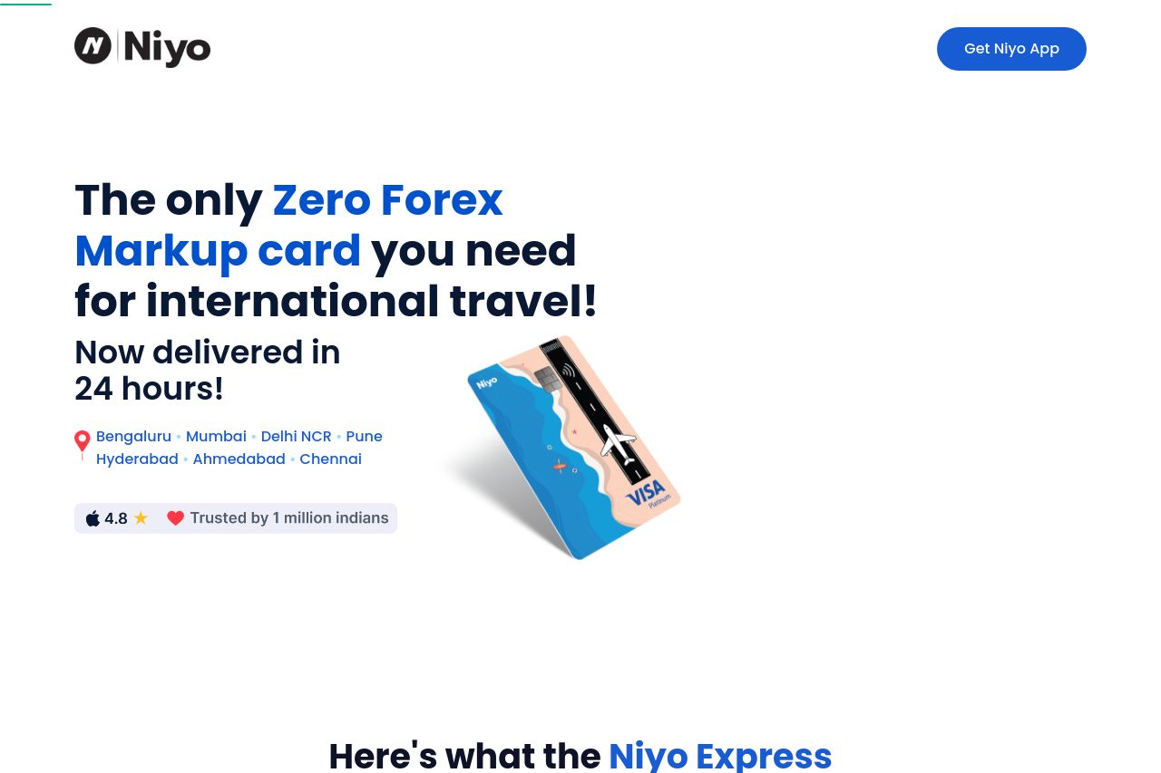
Enjoy your international travel with the best travel card Niyo Global and enjoy zero markups on your Forex transactions. Save money while you travel, and earn 6.5% interest* on your savings account.
Summary:
The landing page for Niyo's travel card is clean and visually appealing, but it falls short in certain areas. The messaging is quite effective, emphasizing the unique selling point of zero forex markup and fast delivery, which is great. However, the audience isn't explicitly defined, making it slightly harder to immediately connect with the target market. Readability is strong, with clear typography and visuals supporting the message. But it lacks punchy, concise text that would make it more digestible. Design-wise, the site maintains consistent branding, yet the visual hierarchy could be improved for emphasis on the call to action. Structure-wise, the flow is intuitive, but it could benefit from more illustrative examples and clarity in navigation. The CTAs are well-placed but lack variety. As for credibility, it scores well with testimonials and partner logos enriching trustworthiness, though there's room for improvement in transparency by clearly displaying contact information directly on the landing page.
- Define the target audience more explicitly to create a stronger connection.
- Enhance CTA text to be more action-oriented and varied.
- Improve transparency with clear contact information on the main page.