worldwidecollab.co
Landing Page Analysis
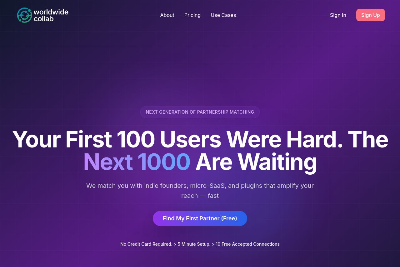
We match you with indie founders, micro-SaaS, and plugins that amplify your reach — fast

Summary:
The landing page for Worldwide Collab mixes clear messaging with bold design choices, aimed at solo founders and SaaS creators. The hero section effectively grabs attention with a solid value proposition: "Your First 100 Users Were Hard. The Next 1000 Are Waiting." The juxtaposition of a casual message with a professional tone adds a layer of engagement. However, the CTA buttons, while action-oriented, need better placement to maximize visibility and actionability.
Readability is mostly solid, though the use of too many dark backgrounds can get a bit dreary. The contract and offer details get a bit lost with insufficient emphasis on hierarchy and differentiation—certain sections are visually too similar, diluting essential information.
Visually, the page uses cartoons effectively to represent user journeys, but these could be considered slightly juvenile for the target audience. They do help in storytelling but might distract if not aligned properly with brand message.
Structurally, the information hierarchy is serviceable but has room for improvement. Important information needs to be prioritized better, and the navigation between sections could be smoother.
Credibility elements, such as badges or testimonials, are glaringly absent. This could impact trust, especially with a newer company.
- Improve the visibility and placement of CTA buttons to guide users effectively.
- Introduce more differentiation in sections using visual hierarchy and color to make important information stand out.
- Incorporate social proof, such as testimonials or badges, to enhance credibility.