adequateapps.com
Landing Page Analysis
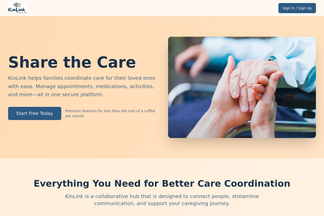
KinLink Caregiver App
Summary:
Overall, the page is decent but lacks distinctive elements to truly stand out.
The messaging is fairly clear, but could do with a stronger value proposition and more defined audience targeting. The design is neat and uses soft, calming colors fitting for the caregiving theme, but doesn't use strong visual hierarchy to guide the viewer's eye effectively. This causes the CTAs to blend in, missing key opportunities for engagement. Consistency is solid, but the layout is somewhat predictable and standard. Structurally, while information is logically organized, it feels a bit generic, lacking an innovative approach to captivate users. Credibility elements like testimonials and social proof are completely absent, which could be crucial in building trust for this kind of service. Improve these areas and the site will be much stronger.
- Strengthen the value proposition in the hero section.
- Improve CTA visibility and differentiation.
- Include testimonials or reviews to enhance credibility.
- Enhance visual hierarchy with better use of fonts and colors.