dephannysventures.com
Landing Page Analysis
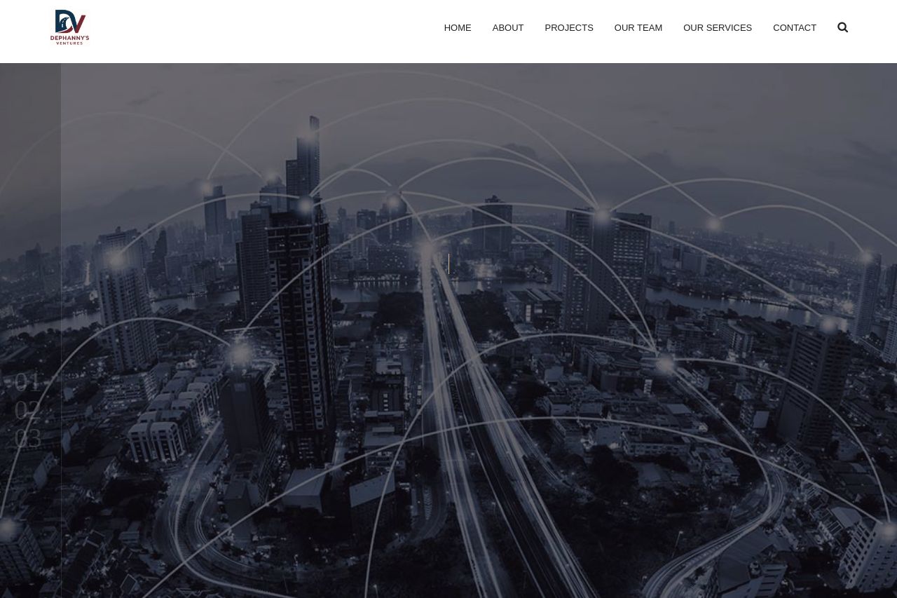
WE CRAFT INFRASTRUCTURE SOLUTIONS.
Summary:
The landing page for DePhanny's Ventures presents a straightforward yet uninspiring design. The hero section provides an adequate initial impression with its focus on infrastructure, civil engineering, and procurement, though the value proposition could be clearer. The second section endeavors to highlight services, but the lack of engaging visuals and detailed descriptions weakens impact. Short, generic text pairs with placeholder imagery in the portfolio section, making the intentions unclear. The contact section is functional, yet feels disconnected with a muted design. Overall, the page's inconsistency, lack of engaging imagery, and generic tone detract from its goal to convey credibility and professionalism.
- Clarify and strengthen the main value proposition in the hero section.
- Enhance the visual appeal and specificity of service descriptions.
- Improve the consistency of the design and visual elements.