thedoctorshrink.com
Landing Page Analysis
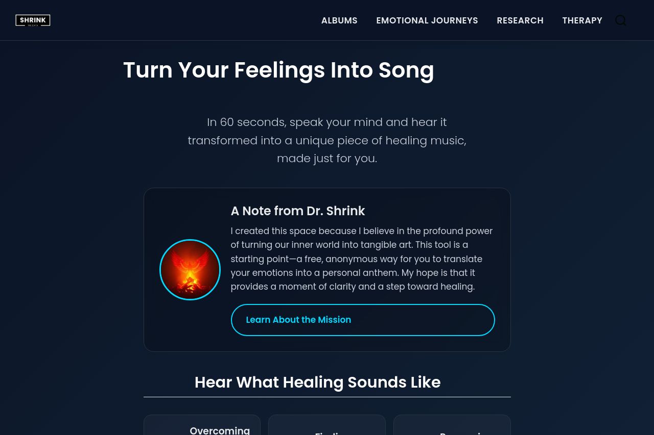
In 60 seconds, speak your mind and hear it transformed into a unique piece of healing music, made just for you.
Summary:
The landing page has an appealing design, utilizing a dark theme that gives a calming and focused feel fitting for the healing and emotional journey context. The headline, "Turn Your Feelings Into Song," is strong and immediately conveys the page's unique value. However, the supporting text like "A Note from Dr. Shrink" could be more concise to maintain user attention.
The call to action, "Tap to start speaking," is clear but might be buried within the page's flow. Consider placing CTAs more prominently for better visibility.
The navigation structure is simple and understandable, keeping users directed to different sections quickly. Yet, headings could be more distinct to help guide users visually. The page needs more visible trust-building elements; perhaps integrate testimonials for credibility.
Overall, the page puts effort into maintaining visual and messaging coherence with a consistent typography and color scheme, though it can lack elements like testimonials or client logos to bolster trust and credibility.
- Make the main CTAs more prominent to guide user action.
- Include testimonials or reviews to enhance credibility.
- Improve CTA placement for better conversion.