swipepages.com
Landing Page Analysis
Generate leads & increase conversion rate using fast, mobile optimized landing pages. A Landing page builder trusted by 7500+ ROI driven marketers.
Summary:
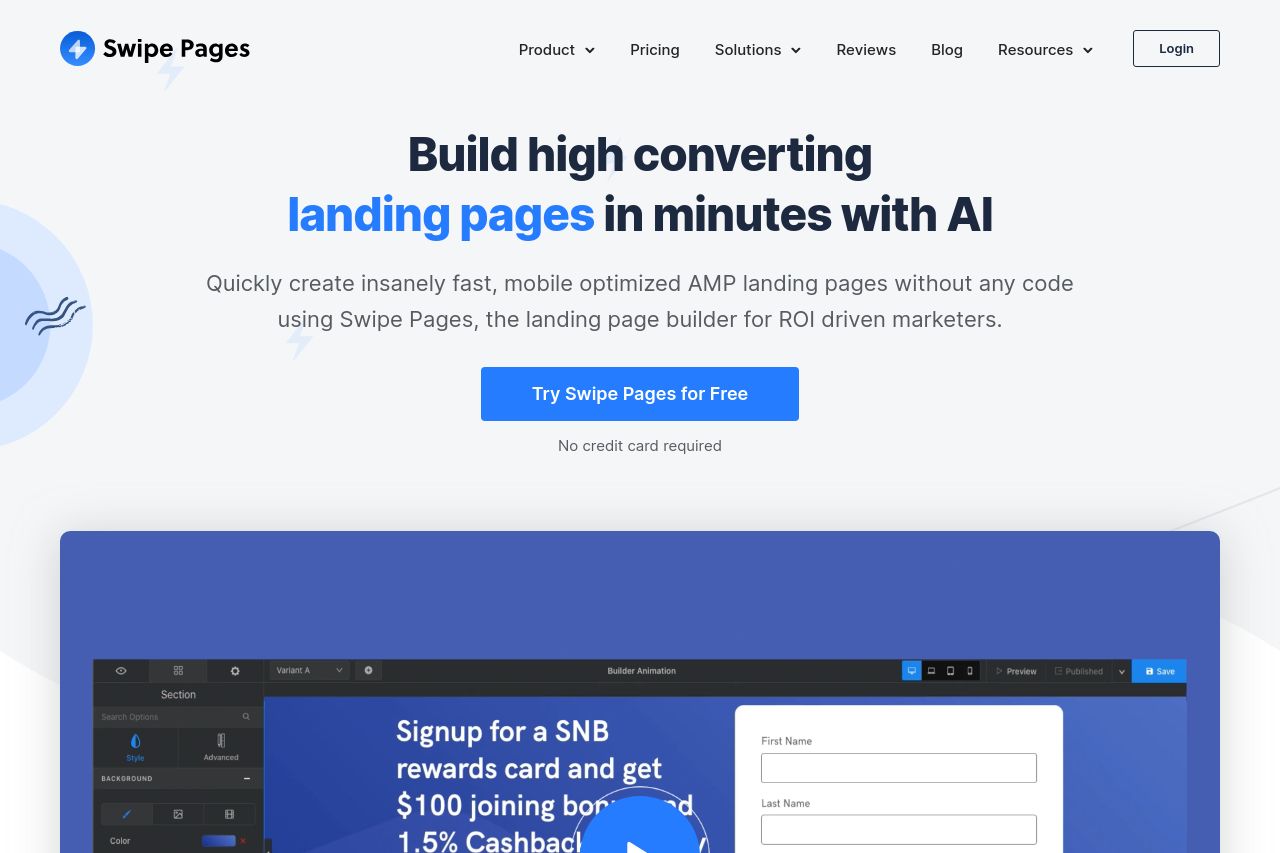
The landing page for Swipe Pages promises a landing page builder tailored for conversions with a sleek, clean design. The site articulates its value proposition effectively with numerous social proof elements, including client logos and testimonials, establishing credibility. However, it somewhat falters in highlighting the unique value proposition distinct from competitors, often relying on broad claims rather than specifics. The consistency in design is commendable, but the page lacks variability in typography which could potentially aid in visual hierarchy for an easier read. Though the audience alignment is generally well-targeted, a more explicit address to the specific needs of marketing agencies and ad managers could enhance engagement further. The CTAs are visible but do not leverage urgency or scarcity as effectively as they might. Overall, the structure is solid with logical progression from one section to the next, but some sections lack depth, especially regarding showcasing product capabilities.
- Enhance the value proposition with specific features that set Swipe Pages apart from competitors.
- Improve CTA effectiveness by experimenting with urgency-inducing elements like 'Limited Time Offer'.
- Refine typography to improve visual hierarchy, potentially using varying font sizes and weights.
- Provide more examples or case studies specifically catering to marketing agencies and ad managers' needs.