actimondo.com
Landing Page Analysis
Vielleicht fühlst du dich gerade genauso. Du hast Fragen, die ChatGPT nicht wirklich beantwortet.

Summary:
This landing page does a decent job at promoting an event focused on nuclear and energy technology careers, but there are several areas needing attention.
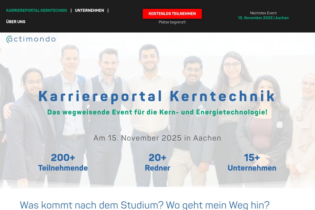
The hero section makes the event date and location clear but falls short of making the value proposition compelling or distinct. The repetitive calls to action lack variety, making interaction feel monotonous. While the design is functionally adequate, it lacks the visual excitement that might engage a student audience.
Messaging is average, targeting students and professionals in nuclear technologies, but doesn’t sufficiently spotlight the unique benefits of the event. Content is straightforward yet lacks a diverse blend of textual and visual elements, which can make the page feel stale.
A professional tone is maintained, but a more engaging and youthful approach might connect better with a student audience. Good use of testimonials offers credibility, but more polished design elements are needed to fully establish trust and professionalism.
- Enhance visual hierarchy with varied font sizes and weights.
- Improve CTA placement with more frequent and strategically positioned buttons.
- Incorporate more visuals and interactive elements to engage users.
- Refine language to better connect with a student audience.