pierre-hofman.com
Landing Page Analysis
Engineering Manager with 10+ years experience in web development and team management. Passionate about innovation and creating quality digital solutions.
Summary:
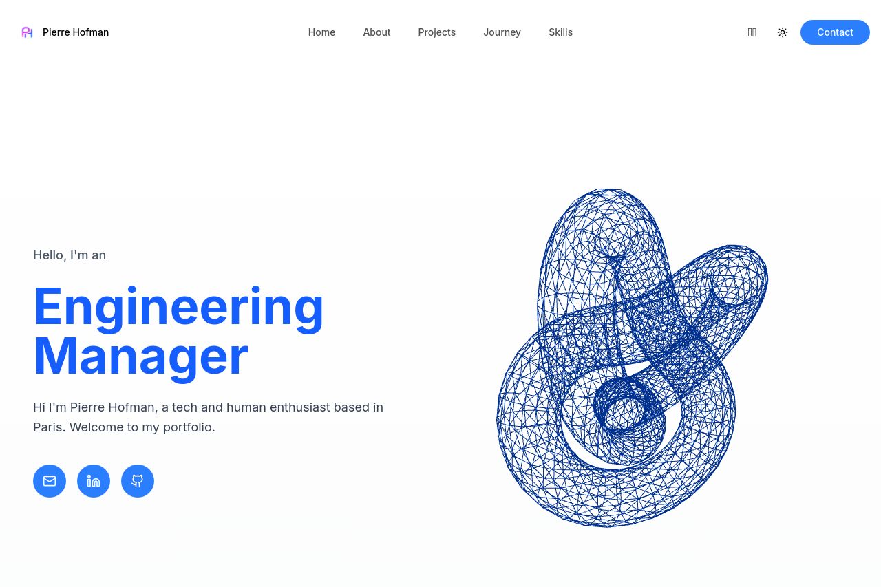
The landing page has a clean and professional look, which aligns nicely with the target audience of recruiters and tech enthusiasts. Good first impression with clear sections such as "About Me", "Projects", and "Journey". The text is simple and easy to read, which is great for keeping users engaged.
However, some areas fall short. The "Engineering Manager" title is bold but doesn't flesh out tangible benefits or unique selling propositions that distinguish Pierre from others in his field. The "About Me" section uses a lot of space without giving a strong, concise pitch. CTAs, like "Let's Connect," lack urgency and persuasion, failing to guide the user forcefully down the conversion path. Additionally, the project thumbnails are engaging, but the detail could be better emphasized, as they're just a list with no narrative or showcased outcomes.
Social proof elements are missing, which could bolster credibility further. Adding testimonials or recognizable collaborations can make a significant impact here. Overall, the design holds potential but needs refinement in its messaging and call-to-action strategy to be truly effective.
- Enhance the value proposition on the hero section to emphasize unique skills or achievements.
- Add testimonials or client logos for increased credibility.
- Revamp CTAs to make them more engaging and action-oriented.
- Consider detailed descriptions or case studies for projects to provide more context.