benaughty.com
Landing Page Analysis
Does it seem hard to meet 'the one?' Stop searching blindly! Enjoy a thrilling experience at this online dating site. Check out Be Naughty US.
Summary:
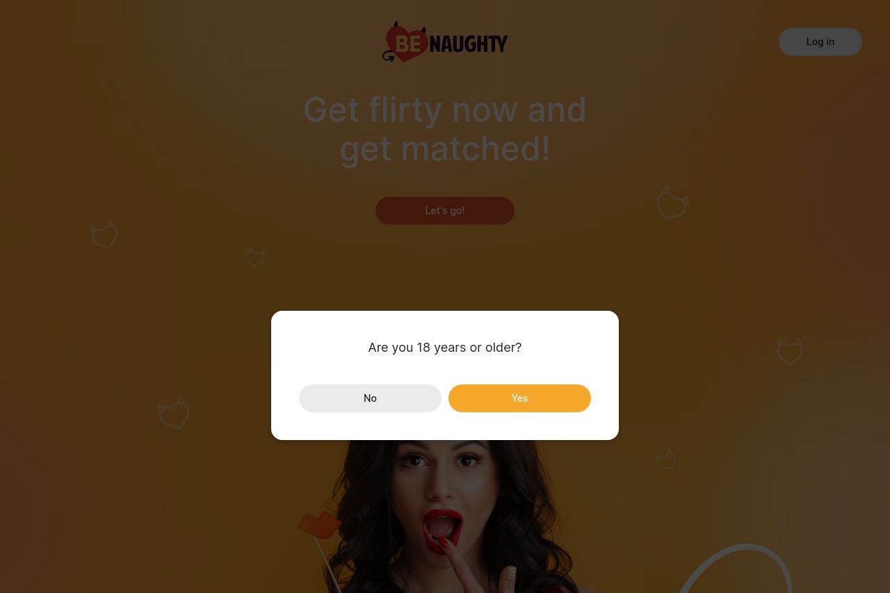
The landing page for BeNaughty.com needs a cold hard reality check.
It's trying desperately to be tantalizing but ends up looking more like a confused mishmash of sugary promises without enough clarity or oomph.
While the imagery aligns with the supposed naughty theme, it's easy to forget because the page is cluttered with generic text that fails to communicate a clear value proposition or establish a strong trust factor. It's like wandering through a messy candy store with no idea of what's worth buying.
Although the site undoubtedly is targeting a specific audience, the alignment is sloppy and can alienate both novices and seasoned online daters. Everything from the typography to the visuals seems off-balance and half-baked, lacking in polish and seriousness that even a casual dating site should project.
- Simplify the main value proposition to make it crystal clear what sets this site apart from others.
- Improve the font sizes and color contrast to enhance visual clarity and emphasis on important points.
- Add clear trust signals and social proof elements to boost the site's credibility.