framer.app
Landing Page Analysis
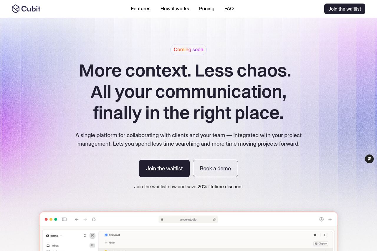
Boost productivity with seamless task and team management. Effortlessly manage tasks, collaborate with teams, and meet deadlines with precision and clarity.
Summary:
Overall, the landing page does a solid job in presenting its value proposition, though it lacks some emotional engagement and specificity needed for B2B service providers.
The tone is somewhat dry and might come off as generic at times, failing to deeply connect with the target audience. While the design is visually appealing, with good use of white space and contrast, it can sometimes be overloaded with text in some sections where brevity could be more effective.
On the positive side, the features and benefits of the platform are presented in an organized fashion, with clear CTAs, but there's room for improvement in hierarchy and distinction between headings. The structure follows a logical flow, but some sections feel repetitive. Credibility elements like logos are well-placed; however, more testimonials would bolster trust. In sum, the page is decent but could be improved in terms of messaging and engaging the target audience more profoundly.
- Clarify audience-targeted benefits in the hero section to immediately connect with B2B providers.
- Enhance emotional engagement with more personalized language and storytelling elements.
- Include more testimonials or case studies to strengthen credibility and trust.