taiko.media
Landing Page Analysis
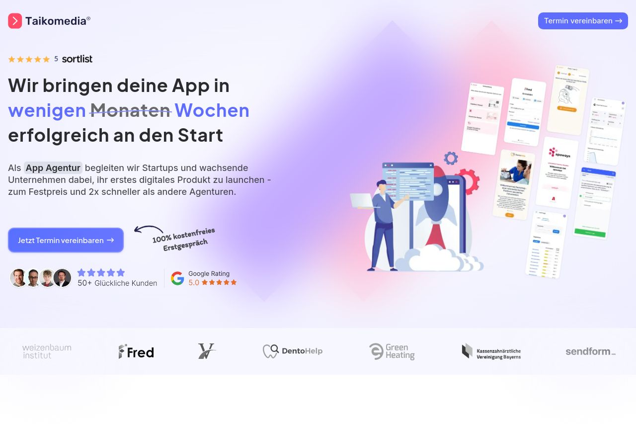
App Agentur | Taikomedia | Agentur für digitales Wachstum
Summary:
The landing page overall is quite effective in presenting itself to startups and growing companies in the digital space.
The messaging is somewhat clear but misses in being truly compelling for startup founders. While there is effort to communicate the value proposition, the attempt at both addressing and solving startup challenges doesn't immediately resonate due to somewhat generic phrasing.
In terms of readability, the page does relatively well with clear text contrast and some good use of headings, but the structure could use more clarity. Information sometimes feels scattered, rather than following a logical, compelling path.
Design elements are mostly consistent, though not particularly standout. The use of color is generic and a bit bland; nothing pops out to grab attention. The CTAs are visible but lack the urgency or drive that would push a founder to take action immediately.
The credibility is bolstered by testimonials and a solid list of clients. However, it could communicate more about the team’s expertise right at the hero section to build immediate trust, which is crucial for first impressions.
Overall, the landing page gets the job done but lacks the high-impact polish and emotion needed to get a startup founder excited about partnering with Taikomedia.
- Revise the value proposition to be more impactful and specific to startups.
- Improve visual hierarchy to enhance the flow of information.
- Enhance CTA design and add urgency to encourage immediate action.