tetatune.com
Landing Page Analysis
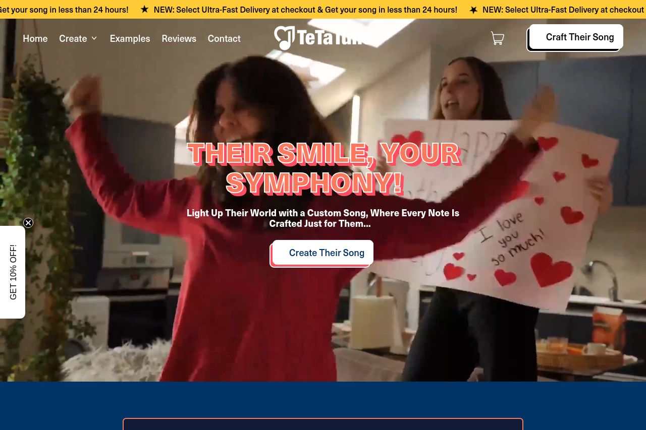
🎶 Create full personalized songs for your loved ones! delivered in less than 72h. Tell us about the special person and get a tailor-made song in no time. Ready? Let's kickstart your personalized Tune
Summary:
The unified branding is consistent and the value proposition is clear with a unique and sentimental offering—personalized songs in under 72 hours. The color scheme is attention-grabbing, but the combination of bold fonts with shadowing effects can make the page look cluttered and might overshadow the content. Social proof is leveraged effectively with numerous testimonials and visible customer feedback. However, the calls to action suffer from a lack of visual differentiation and are easy to miss among the other brightly colored elements. The text content is approachable but occasionally loses clarity with unnecessary fluff.
- Improve CTA visibility by using a more contrasting color or larger, bolder font.
- Simplify some text elements to ensure clarity and succinct messaging.
- Reorganize social proof to reduce clutter and improve testimonial visibility.