aymahfragrances.com
Landing Page Analysis
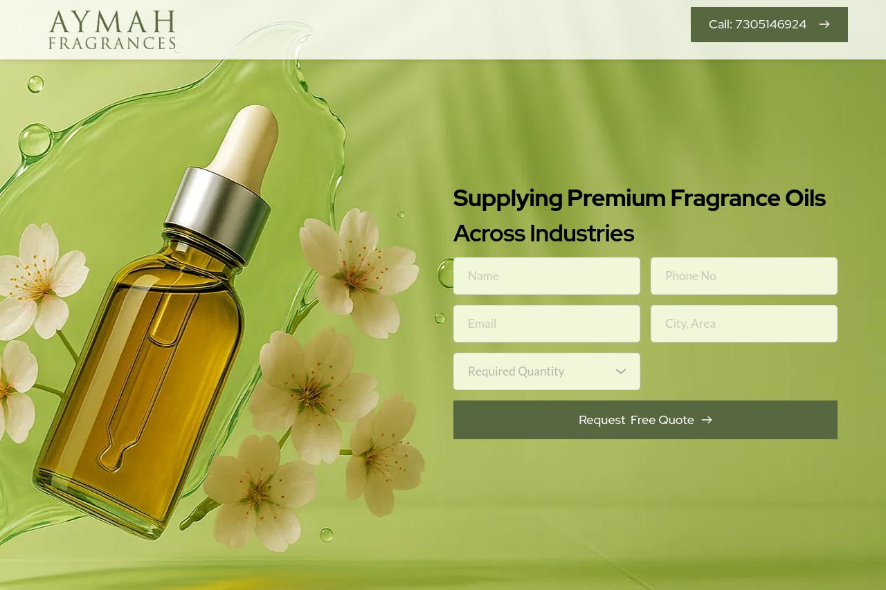
Supplying Premium Fragrance Oils
Summary:
The landing page for Aymah Fragrances attempts to communicate its offerings but falls short in several areas. The imagery supports the fragrance theme, but the overall presentation feels a bit generic and lacks distinctive elements to set it apart.
On the positive side, the use of green colors aligns with nature and freshness, which is appropriate for a fragrance supplier. However, the page layout is somewhat cluttered with varying font sizes and inconsistent use of call-to-action buttons that can confuse visitors.
Moreover, while the text provides some product details, it doesn’t do enough to clearly communicate unique benefits or create a compelling reason for engagement. Social proof elements like testimonials or reviews are noticeably absent, which impacts credibility.
In terms of engagement, the contact information remains easily accessible, which is a plus, yet the overall tone is flat and doesn't engage the target audience effectively.
The lack of a distinctive value proposition alongside a rather uninspired and overused design layout makes the site forgettable – improvements in user targeting and a more dynamic design could turn this around significantly.
- Clarify the main value proposition and highlight unique selling points.
- Add social proof elements such as testimonials or client logos to increase credibility.
- Improve CTA consistency and placement to guide user actions effectively.
- Enhance the visual hierarchy and typography for better readability.