stackstaging.com
Landing Page Analysis
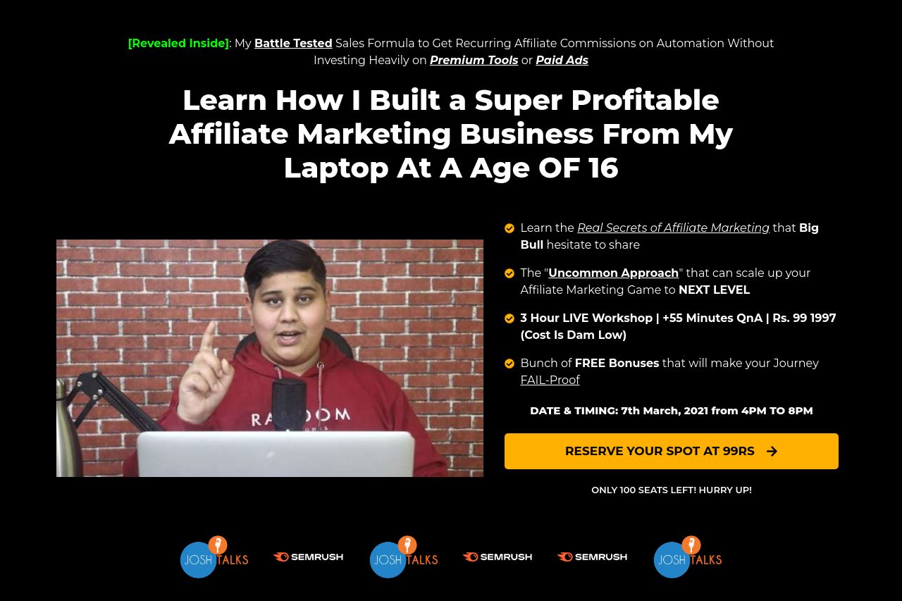
[Revealed Inside]: My Battle Tested Sales Formula to Get Recurring Affiliate Commissions on Automation Without Investing Heavily on Premium Tools or Paid Ads
Summary:
The landing page desperately tries hard to sell the workshop with way too much flashy text and urgent calls to action. The contrast between the bright yellow CTA buttons and the dark background is effective, but the overall design screams "scammy." The pricing strategy is overemphasized causing skepticism rather than trust. Value propositions are somewhat clear but come off as overpromising with phrases like "7 Figure Internet Marketer" and "Ultimate Ebook Collection.” The typography is inconsistent, shifting between all caps, bold, and varied sizes, leading to a cluttered look. The social proof section seems somewhat empty with testimonials lacking specifics—using "Lorem ipsum" is a rookie mistake. Urgency tactics are pushed to the extreme with repeated price reductions and countdown timers scattered throughout the page.
- Tighten up the typography to ensure consistency and readability.
- Add more genuine, detailed testimonials to improve credibility.
- Reduce the overemphasis on urgency and flashy pricing tactics.