popsy.ai
Landing Page Analysis
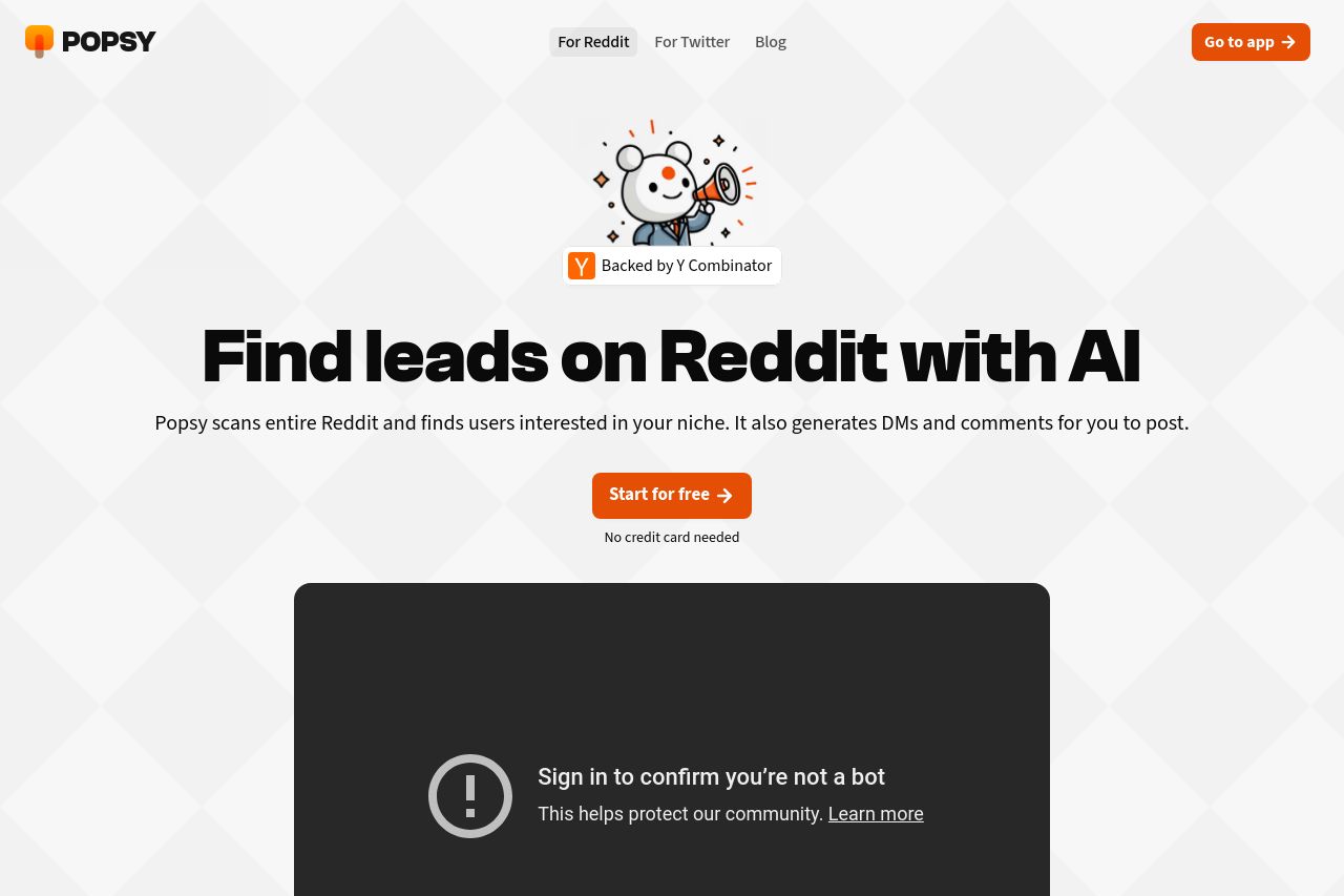
Find leads on Reddit with AI. Generate & send them hyper personalized DMs.
Summary:
The Popsy landing page does a decent job at presenting its offerings but lacks clarity in some areas.
The design is visually clean, aligned with consistent colors and typography which enhances readability. However, the messaging falters slightly, with a clear but somewhat uninspiring value proposition. The main problem is a lack of distinctiveness – phrases like "Find leads on Reddit with AI" don’t really engage or excite.
The structure flows well overall, but the page could benefit from more detailed descriptions or insights into how exactly Popsy works, instead of long-winded text in certain parts. Visual clarity and whitespace usage are decent but clutter ensues in testimonial sections, making it feel overwhelming.
On the credibility front, including Y Combinator backing is a nice trust signal, but more can be done to establish trust, like showcasing detailed user success stories. The prevalence of social proof is nice but feels repetitive and not well-curated.
Overall, the landing page ticks many boxes but leaves room for refinement in messaging clarity, actionability, and readability. Addressing these details could enhance conversion significantly.
- Enhance value proposition with emotional appeal and specificity.
- Utilize more dynamic language to engage the audience.
- Curate the testimonial section to show varied voices and data.