finitechitalia.com
Landing Page Analysis
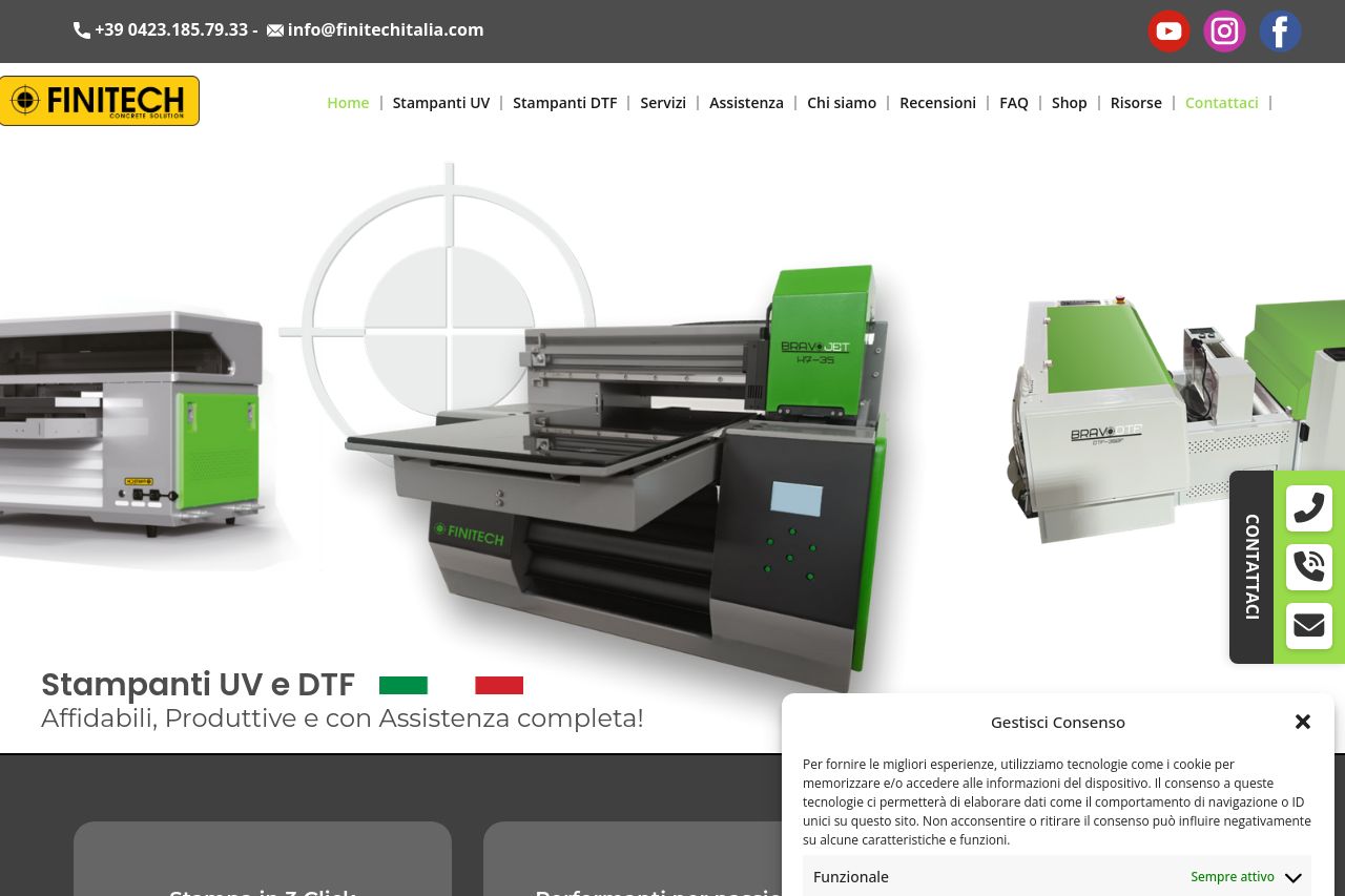
Finitech Stampanti UV e DTF Professionali Performanti e con Assistenza completa! Stampa in 3 Click. Progettate per la massima resa. Assistenza in tutta italia.
Summary:
The Finitech landing page has room for improvement despite a functional structure.
The value proposition is not immediately clear, though there are mentions of product quality and Italian manufacturing. The audience alignment suffers as content tries to cover too many bases without directly targeting a specific user persona, leading to a lack of engagement in the messaging.
Readability is generally fine, but the text can get dense in places, making it difficult to digest. The typography is clean but lacks hierarchy, which affects the clarity. Design elements are inconsistent, and the CTA buttons blend too much with the rest of the content.
Structure of the content is logical but some critical information is buried, making the purchase process confusing. CTAs do not stand out enough and focus is hindered by multiple competing elements like consent pop-ups.
Social proof is minimal and does not build enough credibility. There's reliance on claims without solid backing like testimonials or recognizable logos. Professionalism needs a boost in consistency of design and proof.
Overall, some sections of the page are well-executed, but the scattered focus and lack of strong audience engagement reduce the landing page's effectiveness as a whole.
- Improve the clarity of the value proposition by explicitly stating the unique features or benefits of your products.
- Enhance CTA visibility and relevance. Make sure they stand out and are action-oriented.
- Incorporate more social proof like testimonials or recognizable client logos to build credibility.