campane.ai
Landing Page Analysis
Instantly generate high-performing ad creatives with Campane. Trusted by marketers, startups, and agencies to launch smarter, faster campaigns using AI.
Summary:
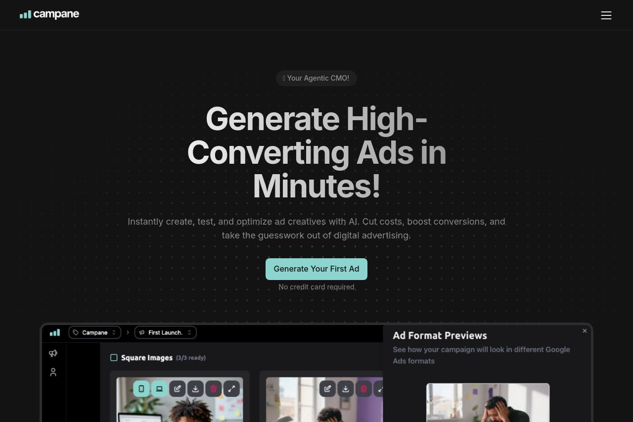
The Campane landing page does a decent job in terms of presenting its message and services, with a clear focus on AI-powered ad creation. It effectively highlights the main value proposition: generating high-performing ads quickly and efficiently using AI tools. The language is straightforward and relatively easy to understand, although it sometimes comes across as too generic. The value proposition is strong, with emphasis on ease of use, no credit card registration needed, and the idea of being a "Your Agentic CMO!"
Design-wise, the page is minimalistic but may be slightly dull. The dark theme provides nice contrast for most elements, but the monotony could bore the viewer quickly. The section hierarchy generally makes sense, but the visuals could use a more engaging variety to draw attention. Information density, use of testimonials, and the CTA buttons are well-placed for usability, but they lack punch and excitement. With consistent fonts and colors, the design achieves a standard of professionalism, but lacks uniqueness and wow factor.
There's plenty of Open Graph potential wasted here. The current title and description are vague and don't drive the impulse to click, while the Open Graph image is just the logo, missing an opportunity to entice with eye-catching visuals or an attention-grabbing tag line.
- Improve the Open Graph image to include a catchy tagline or visual element that stands out.
- Diversify visual elements for added engagement, incorporate more color variance.
- Strengthen the CTA language to make it more compelling and distinct.