thedoctorshrink.com
Landing Page Analysis
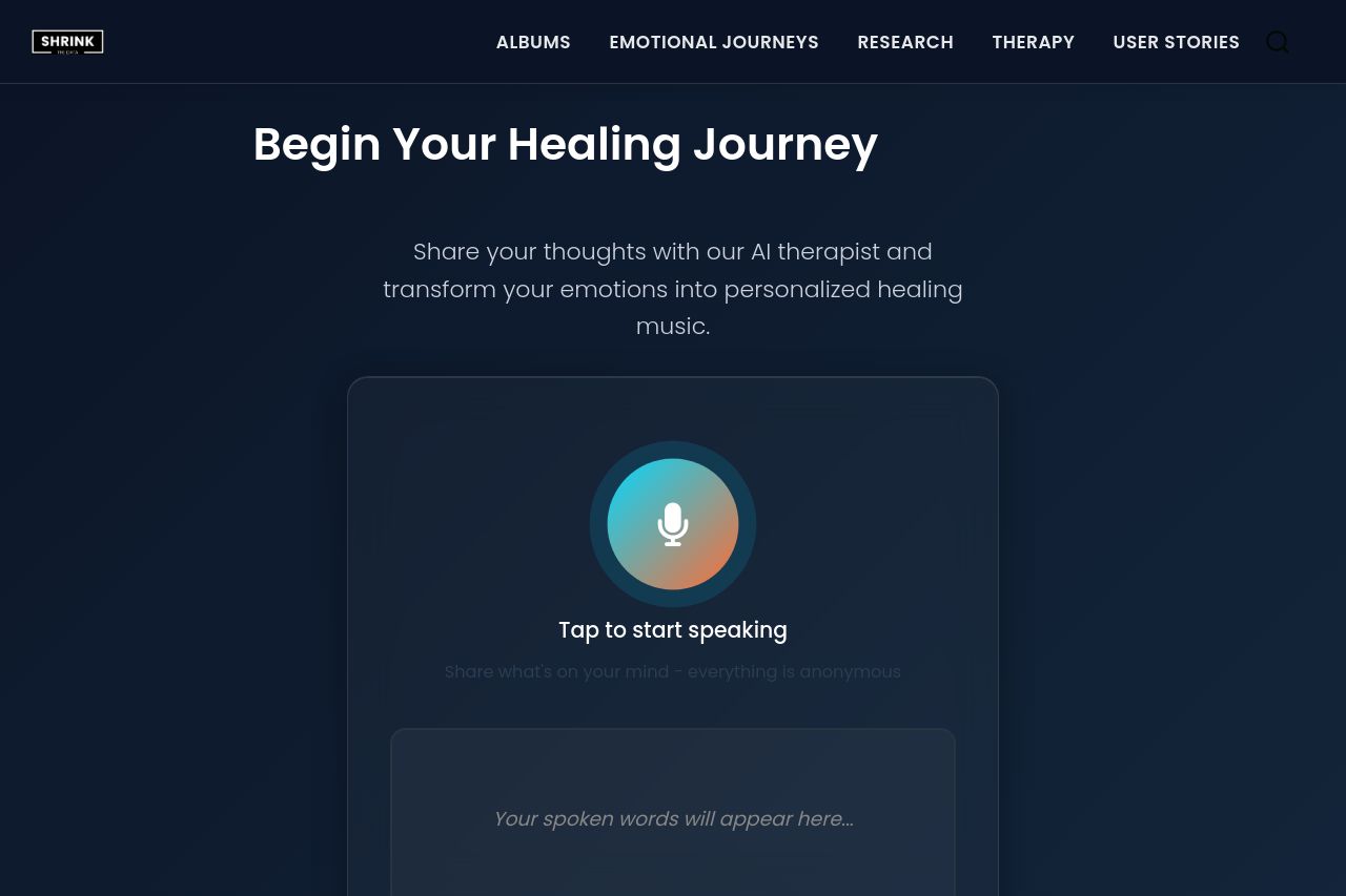
Share your thoughts with our AI therapist and transform your emotions into personalized healing music.
Summary:
The landing page manages to create a calm and inviting atmosphere, appealing to the audience interested in healing and therapy through music. The inviting prompt "Begin Your Healing Journey" immediately conveys the purpose and encourages interaction. The use of dark colors complements the idea of a reflective space, but the overall bland layout lacks elements that particularly stand out. The call-to-action could be made more prominent.
The messaging to connect with an AI therapist is innovative but could be misrepresented as impersonal due to a lack of human touch. The "Tap to start speaking" feature is interactive but doesn't fully explain the process or benefits clearly. The page's readability is fairly good, with appropriate font sizes and colors, yet relying too much on text minimally spaced out. While sections follow a logical flow, some content feels too simplistic, and opportunities for more visuals are missed. The credibility is somewhat enhanced by transparency elements like email contacts—however, more social proof would strengthen trust.
- Enhance the visibility and contrast of call-to-action buttons.
- Include examples or visuals of how the music therapy works or feels.
- Add testimonials or user stories for credibility.