infotechacademy.in
Landing Page Analysis
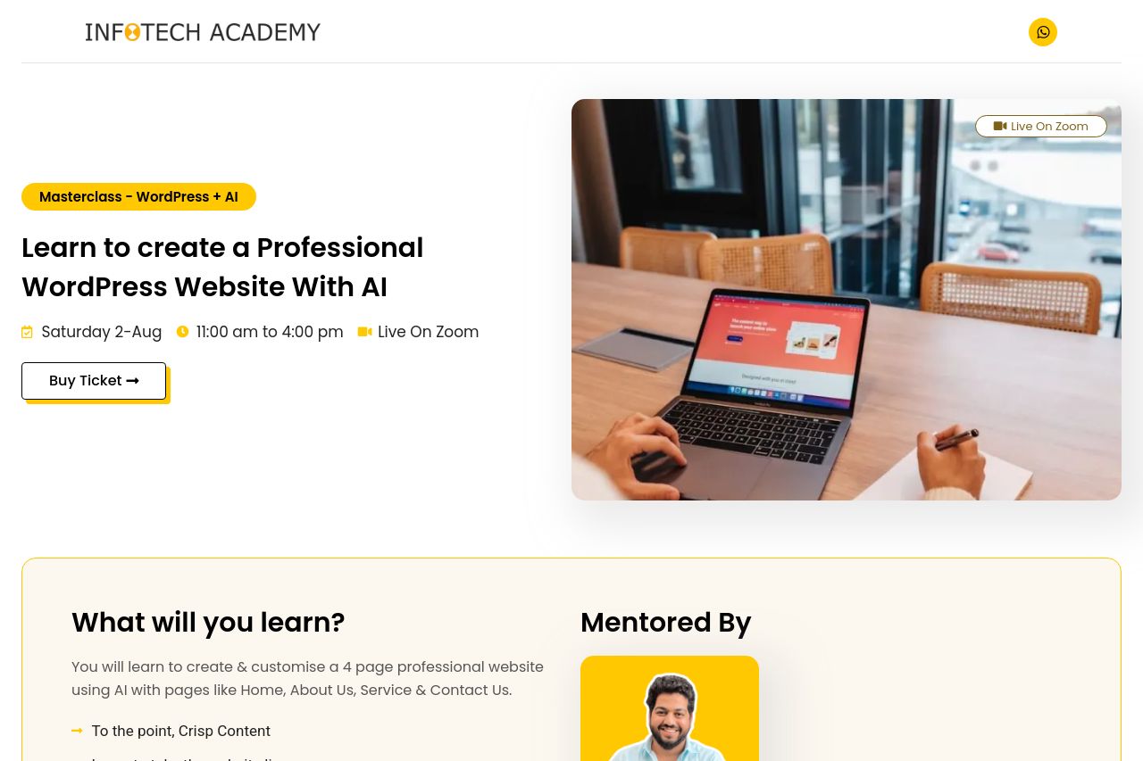
You will learn to create & customise a 4 page professional website using AI with pages like Home, About Us, Service & Contact Us.
Summary:
The landing page for the WordPress AI Masterclass is littered with missed opportunities and inconsistencies. The messaging is passable at best, giving a vague idea of what the masterclass offers but failing to excite or draw users in with a unique value proposition. There are few interactive elements, and crucial details like specific use cases or benefits of using AI with WordPress are notably absent.
Readability? More like a reading chore! The text is excessively dense, with big blocks of content that would make any reader sigh with exhaustion. The font is generic, and there's an utter lack of typographic hierarchy, making scanning through the content a study in patience.
Design feels like a hastily concocted canvas project. There's a minimal attempt at visual hierarchy, leading to confusion about what the reader should be focusing on, thanks to the monotonous color scheme and similar sizing across elements.
The overall structure could use a map and compass, with information presented in a meandering flow, devoid of logical progression. Important call-to-action elements are plagued by poor placement and lack of distinct visual separation.
Where the page barely redeems itself is in credibility with some social proof, but even that is peppered with repetitiveness and odd formatting choices. Professional it is not; the page feels amateurish and doesn't confer much trust in the quality of what's being offered.
With all these shortcomings, the page is well beneath its potential, leaving a viewer neither convinced nor compelled to take any significant action. Given these flaws, one is left wondering if the masterclass is curated in the same haphazard fashion.
- Redefine and emphasize the main value proposition right at the top of the page to catch the reader's attention immediately.
- Improve the flow of text with plenty of white space to make reading less of a task. Use headlines and subheadings to break the content and improve understanding.
- Develop a stronger visual hierarchy using contrasting colors and font sizes to guide the readers' eyes to important elements.
- Incorporate more specific case studies or examples to better communicate the benefits of participating in the masterclass.
- Rearrange CTAs to a more prominent location; ensure they are consistently distinct and action-oriented.