com.au
Landing Page Analysis
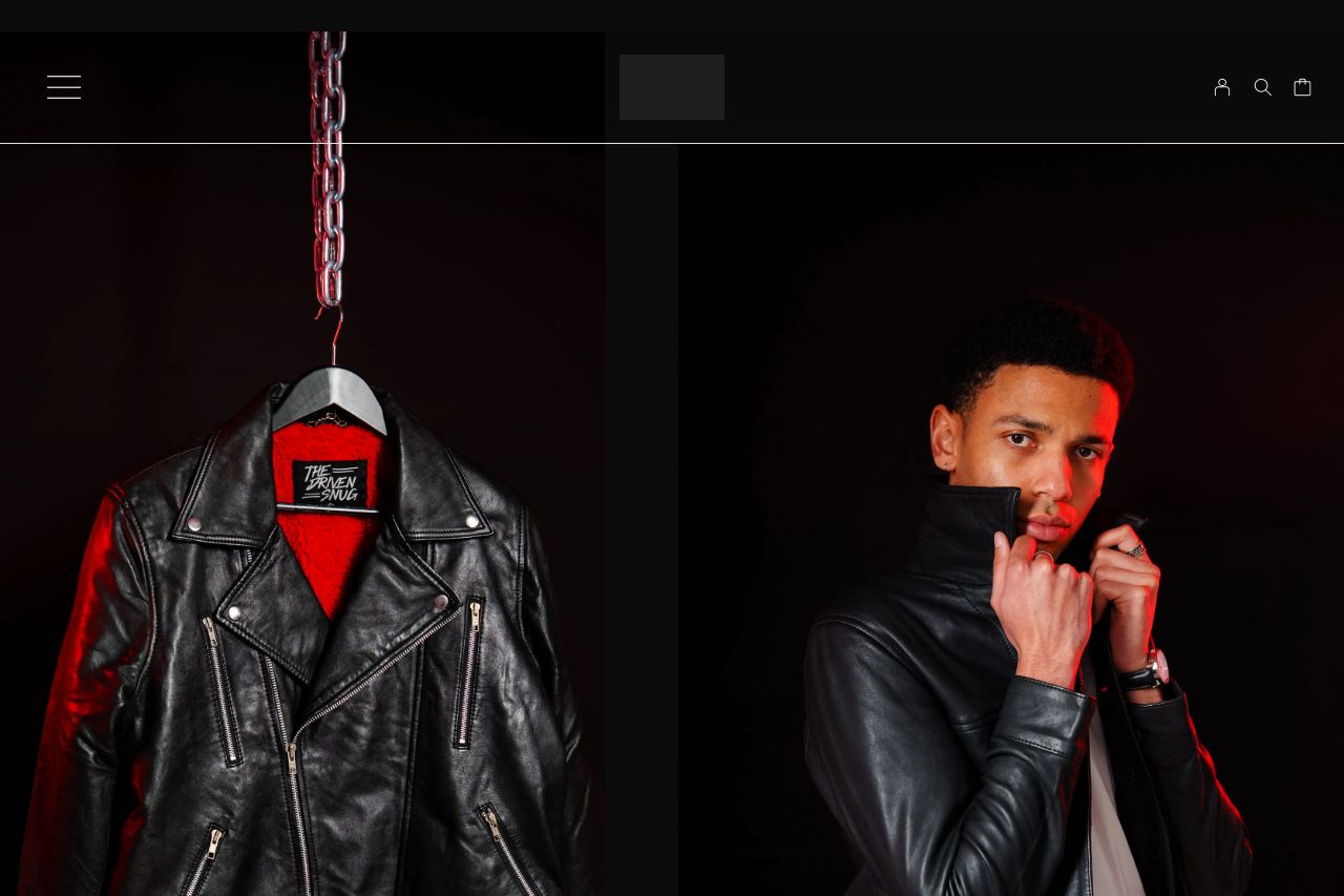
Born of rebellion, stitched in chaos. Built to last, worn to conquer! We forge substance, not surplus — our limited line‑ups speak louder than mass‑made noise.
Summary:
The landing page for The Driven Snug showcases both strengths and glaring weaknesses. Visually, the design captures attention with bold photography and consistent aesthetics, but this strong start is let down by text sections that are overly verbose and buried amidst images, making it difficult to focus on the actual selling points. Messaging lacks the precision needed to immediately draw in and inform customers about key benefits, leading to a vague user experience. There's a noticeable lack of direct call-to-actions, which leaves users guessing. Readability is further hampered by small, low-contrast fonts that clash with the dark theme, diminishing immediate comprehension. While credibility is boosted with a showcase of detailed product features, the absence of more robust testimonials limits its effectiveness. Holistically, while elements of class and exclusivity are communicated, they are overshadowed by a cohesive messaging framework that feels unfinished and lacks urgency to click or buy.
- Enhance typography by increasing font size and contrast for better readability.
- Add clear and compelling call-to-actions near product descriptions.
- Improve messaging clarity by focusing more on key benefits and differentiators.
- Incorporate more customer testimonials for credibility.