dailywriterapp.com
Landing Page Analysis
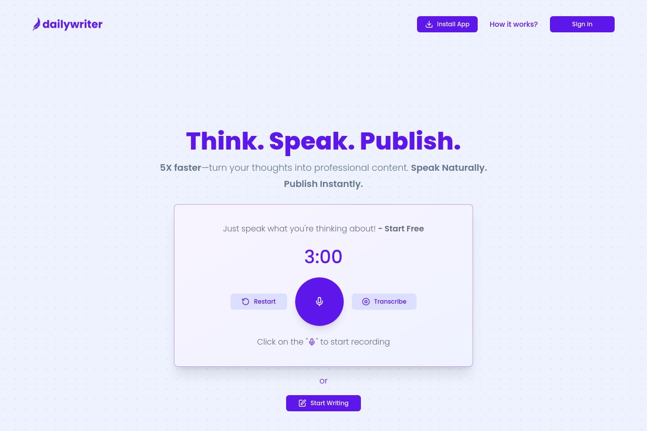
Publish 5x faster with your voice
75
Share on:
Summary:
70
Messaging
70
Readability
75
Structure
60
Actionability
75
Design
80
Credibility
DailyWriterApp landing page makes a solid first impression with a clean and professional layout. The color scheme is cohesive, aligning well with the target audience, though some areas could use more contrast to boost readability. Messaging is straightforward, showcasing the main value proposition effectively. However, there could be more emphasis on who exactly this product is ideal for. While the CTA placement is generally intuitive, the CTAs themselves lack a sense of urgency and actionability. Social proof elements like testimonials are a strong point but could be expanded upon.
Main Recommendations:
- Enhance CTA text to be more action-oriented and urgent.
- Improve contrast in some text areas for better readability.
- Add more specific use cases to align with different audience segments.