figma.com
Landing Page Analysis
Created with Figma
Summary:
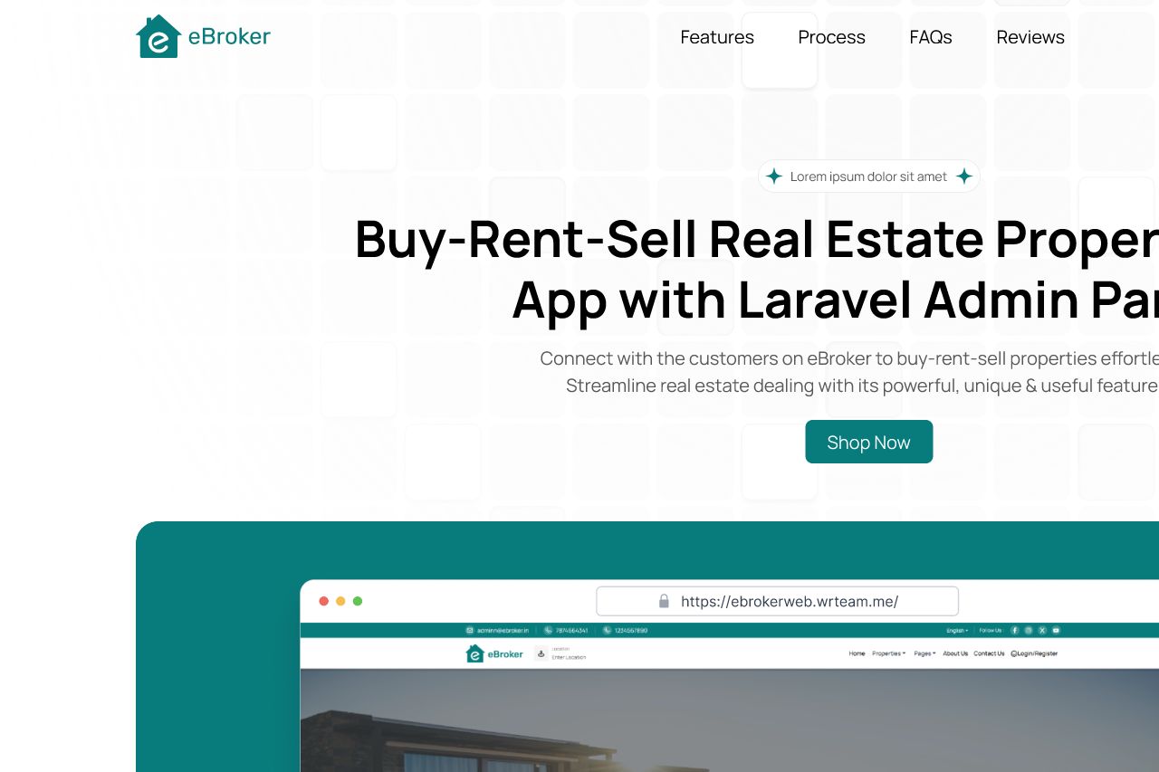
The landing page has a clear main headline, "Buy-Rent-Sell Real Estate Property App with Laravel Admin Panel," which straightforwardly indicates the primary service offered. However, the call to action "Shop Now" is irrelevant to the context of real estate and might confuse potential users. The overall design feels somewhat bland with a generic template vibe, lacking unique distinguishing visual elements. The text layout and font choices are efficient and easy to read, yet there is a lack of visual interest or hierarchy that would guide the user through the page more effectively. Content is sparse and generic, with placeholders like "Lorem ipsum dolor sit amet," making it feel unfinished or hastily put together. There is minimal social proof, leaving the credibility of the product unestablished. Targeting the correct audience isn't clearly evident, leaving potential leads uncertain about why they should choose this service over others.
- Replace the generic CTA "Shop Now" with something more relevant, like "Start Exploring" or "Get Started."
- Remove placeholder text and provide real, impactful content that communicates the value and features of the product.
- Incorporate trust elements such as customer testimonials, client logos or case studies to enhance credibility.