easyupgrades.org
Landing Page Analysis
Affordable, 100% legal upgrades for YouTube, Spotify, Crunchyroll, Disney+, Discord, and more—no shared accounts, no bots, no risk. We use official regional pricing from countries like Nigeria and Egy
Summary:
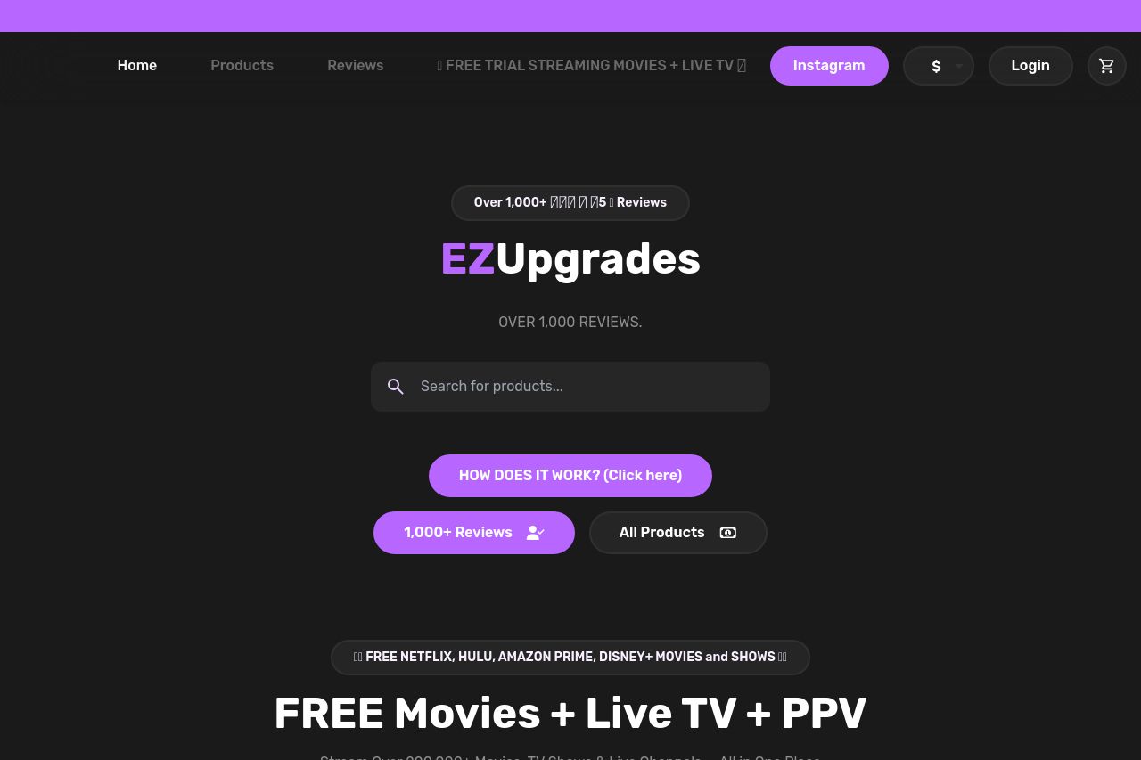
The landing page of EasyUpgrades.org has a modern design with a dark theme that can be appealing and create a sense of professionalism. However, the site overall feels cluttered, and the messaging lacks clarity, which could confuse visitors. The value proposition is scattered, and the CTAs are not prominent enough. While there are numerous product showcases, the missing concise and direct call-to-action could reduce conversions. The design doesn’t align perfectly with the audience's expectations, as it looks like a hasty assembly of various promotional elements. Social proof elements are present, yet they are not highlighted effectively. Clarity and focus on key products or services are needed to enhance actionability and credibility.
- Clarify the main value proposition in the hero section to grab attention quickly.
- Ensure CTAs stand out more with better contrast and clearer language.
- Improve structure by logically organizing sections and reducing clutter.
- Enhance credibility by explicitly displaying trust elements and social proof.
- Refine readability by simplifying text and ensuring consistent typography.