goupgrades.com
Landing Page Analysis
📺 Tired of ads? YouTube Premium now just $5!
Summary:
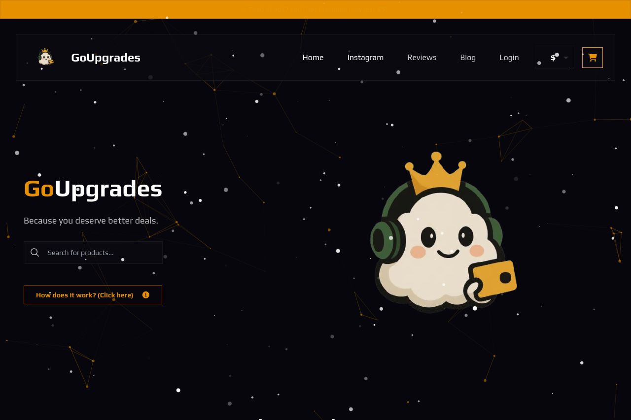
This landing page is visually interesting but does have some issues that need addressing. The design is cohesive with a unique style, especially in the hero section with the animated mascot. The color scheme is bold and uniform; however, it may be a bit too dark, which could detract from readability and overall accessibility. The contrast between text and background is decent, but there might be room for improvement to ensure clarity across all devices.
The messaging lacks clarity. The value proposition isn't instantly clear, and the text is somewhat vague, like "Because you deserve better deals," which doesn’t specify what’s being offered. The target audience appears unclear, causing potential confusion for new visitors.
Call-to-actions (CTAs) suffer from placement and lack of urgency. They're scattered and don't guide the user effectively through the purchase funnel. Though the page features animated elements, which are engaging, their placements could be refined.
Furthermore, credibility elements are present but not maximized. Reviews are included, which help build trust, yet there's minimal information on the company's transparency, like a physical address or detailed contact information.
- Clarify the value proposition by stating explicitly what services or products are offered.
- Improve CTA visibility and ensure placement encourages action immediately after understanding content.
- Brighten the color scheme to enhance contrast and readability.
- Include more detailed company information to increase transparency and trustworthiness.