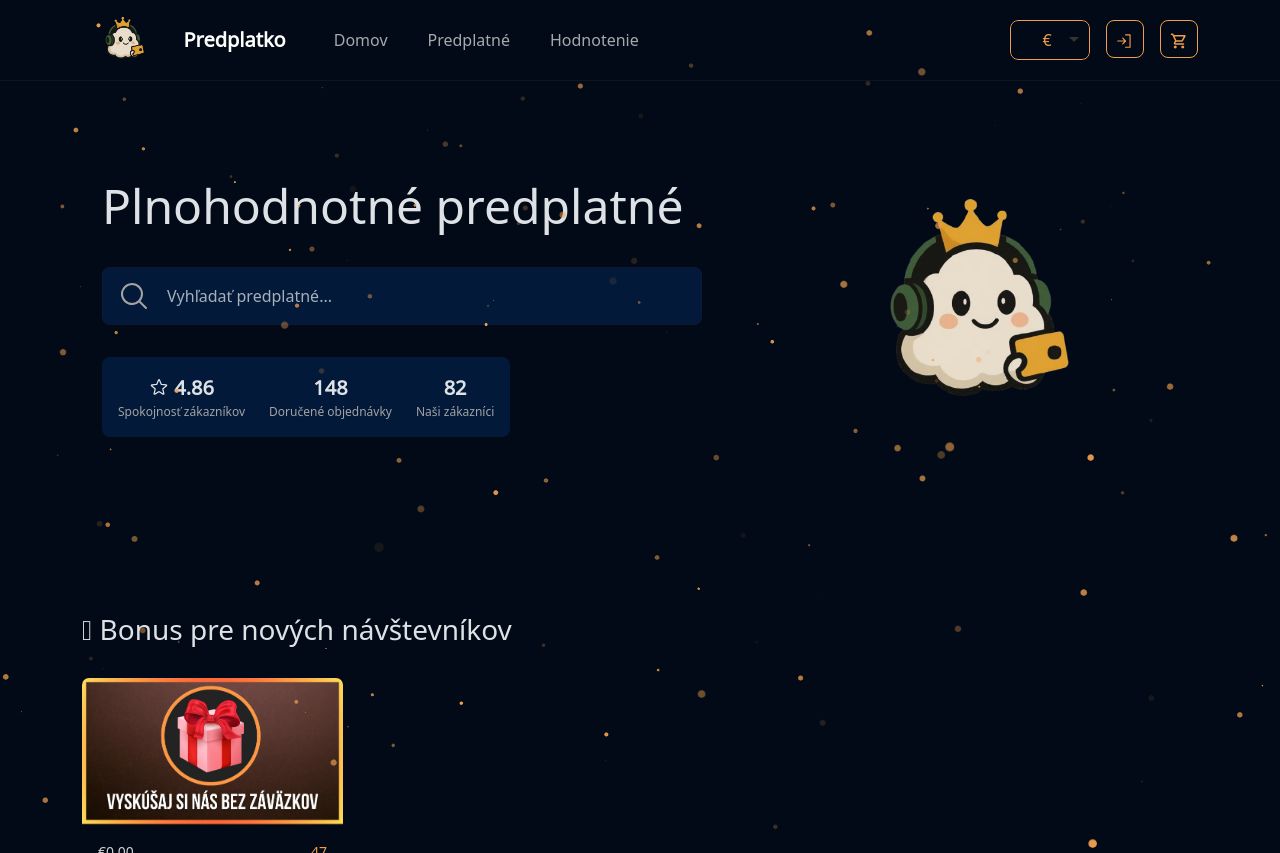
predplatko.sk
Landing Page Analysis

Summary:
The "Predplatko" landing page shows potential but misses key elements. The hero section kicks off with a headline that unfortunately lacks clarity in communicating what is offered. The search feature is oddly prominent with no context. There’s an interesting appeal with the graphics, yet the dark background makes readability suffer slightly due to insufficient contrast at some points. Trust indicators are provided well through customer ratings but aren't leveraged as effectively as they could be due to lack of the company’s story or unique promises.
Sections are okay but cluttered. Information about features like regional pricing is good, but the layout doesn't guide the eye well due to large blocks of text and icons that don’t standout enough. Although testimonials exist, their design isn’t grabbing attention, and the feedback section comes off looking cluttered. Navigation ties are visible, but there’s no real motivation in the copy for users to act urgently.
Overall: While the foundation is there with appealing icons and product offerings, the page feels like it’s trying to do too much at once and sacrifices clarity and engagement.
- Improve clarity of the main value proposition. Explain what Predplatko exactly does.
- Enhance visual emphasis on CTA buttons to make them pop out more.
- Add a brief, enticing product description for each service to draw user attention.