massageonmaintx.com
Landing Page Analysis
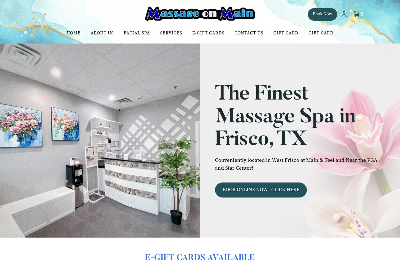
Massage on Main offers body massage services, facials, and natural care in Frisco. At Main & Teel in the Kroger Main St Village.
Summary:
The landing page for Massage on Main is a mixed bag. The overall design is visually appealing and coherent, offering a soothing color palette that fits the spa theme. The value proposition and service offerings are clear, with various massage and facial treatments showcased. However, some areas need improvement. The "Book Now" button is not as attention-grabbing as it should be, potentially affecting conversion rates. Sections feel a bit cluttered with too much textual information, especially the "Testimonials" and "Location & Hours" areas. The navigation menu is straightforward, but the redundancy in "E-Gift Cards" and "Gift Card" buttons could lead to confusion. While descriptions are generally informative, some content lacks engagement, and the overall tone is flat. The use of imagery is appropriate but lacks enough diversity and could benefit from more emotive customer visuals to communicate the spa experience. Lastly, the site does have some social proof, but it can be strengthened further to build trust.
- Enhance the visibility of the primary call-to-action button by using a more contrasting color to make it stand out.
- Reduce text clutter in the "Testimonials" section to focus on impactful phrases or statements.
- Consolidate the "E-Gift Cards" and "Gift Card" sections to avoid redundancy and simplify navigation.