bodyshopsupport.com
Landing Page Analysis
Body Shop IT Support for the Collision Repair Industry — so your body shop runs as smoothly as the cars you repair.
Summary:
The landing page has a clear focus on providing IT solutions for body shops, which is great. However, it feels pretty generic in some areas. The headline "We Keep Your Shop from Crashing" is catchy but lacks additional clarification.
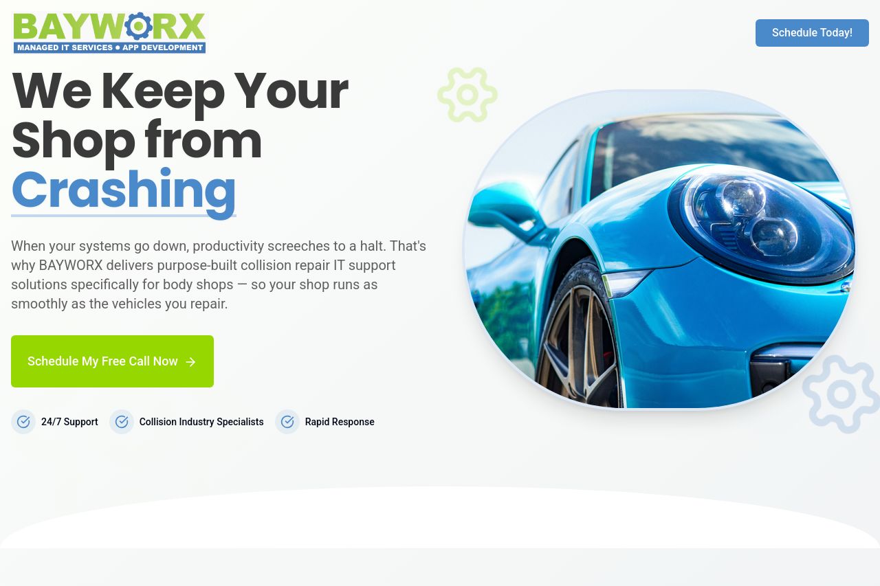
The visual elements help, like the image of the car, but the design feels cluttered with too much happening at once. Colors are well-chosen to maintain a professional look, but the page needs a more distinct visual hierarchy to guide the user's eyes seamlessly.
The readability is decent, with short paragraphs and specific services highlighted. However, the text doesn't stand out as much because of the lack of typographic contrast. Also, varying tones can make the messaging inconsistent, like 'Schedule My Free Call Now' contrasting against other CTAs.
The structure delivers information sequentially, but it isn't particularly engaging, making it a bit hard to retain interest. Social proof could be stronger, and while contact information is present, I don't see strong elements indicating credibility, like testimonials or case studies.
- Enhance visual hierarchy with better font differentiation and spacing.
- Include testimonials or customer reviews for increased credibility.
- Make the CTAs more compelling and consistent throughout the page.