launchdirectories.com
Landing Page Analysis
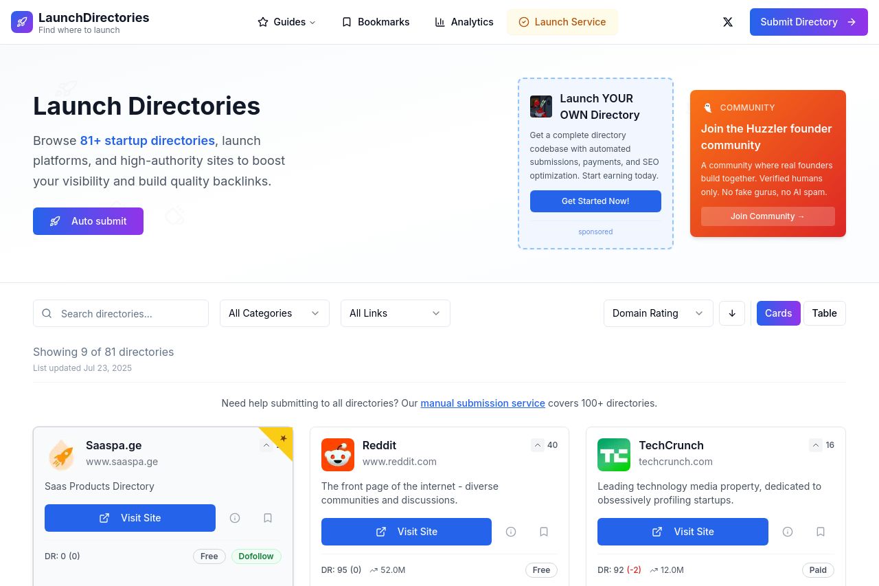
Browse curated startup directories, launch platforms, and high-authority sites to boost your visibility and build quality backlinks.
Summary:
The landing page for Launch Directories is quite strong, with a well-defined purpose and user-centric design. The hero section effectively communicates the main value proposition with clear CTAs like "Auto Submit" and "Get Started Now." However, the design could use a bit more flair to make the calls-to-action pop out more. Some sections appear cluttered, such as the multiple CTAs presented without clear differentiation. Providing more streamlined navigation could enhance user flow. The social proof with logos and a personal touch in the introduction builds credibility. There's room for improvement in making the directory list more visually appealing and distinct. Overall aesthetic and usability are decent, but slight tweaks in CTA design, placing, and visual hierarchy would bring significant improvement.
- Enhance CTA buttons with a more contrasting color or design to increase visibility.
- Reorganize the directory listing for a cleaner appearance, perhaps with better use of spacing or different layouts.
- Simplify navigation by reducing the number of visible CTAs in a single view.