aymahfragrances.com
Landing Page Analysis
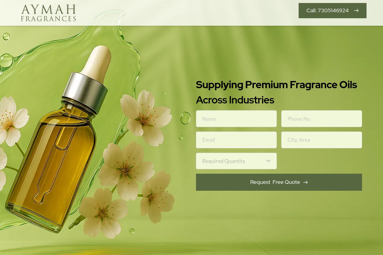
Supplying Premium Fragrance Oils
Summary:
The overall layout of the page is clean and visually appealing, with a pleasant color scheme that aligns with the fragrance theme. However, it lacks a strong visual hierarchy; important elements like CTAs don't stand out enough.
The messaging is somewhat confusing, as it doesn't clearly define the audience or present a compelling value proposition. The text is also too dense in some places, making it less engaging.
Readability is generally good, but some sections feel overcrowded with too much information in one area, leading to visual clutter.
On a positive note, the design is consistent in color and typography, but the coherence is disrupted by a lack of distinct section breaks, making navigation ambiguous.
Overall, the website comes across as professional, yet it struggles with engaging users effectively through clear calls-to-action and streamlined content.
- Enhance the visual hierarchy by making CTAs more prominent with color contrast or size.
- Streamline the text to avoid overcrowding and improve readability with more white space and shorter sentences.
- Define a clearer value proposition and target audience to make messaging more engaging and relevant.