changemakersed.com
Landing Page Analysis
Compassionate, multisensory 1:1 math tutoring for struggling learners, including students with dyscalculia, dyslexia, ADHD, and other learning differences. We create individualized lessons that buil
Summary:
The landing page for Multisensory Math Tutoring is trying to create an inviting and supportive atmosphere for struggling learners. The emphasis on neurodivergent-affirming and individualized learning is nicely integrated throughout the content, but it feels like it’s trying too hard to be all things to all people without making a strong, actionable impression.
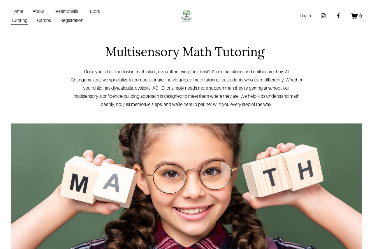
The visual presentation is clean but verges on minimalist to the point of being forgettable. Without bold design choices or compelling images, the page feels a bit too clinical. The lack of standout colors or graphical elements causes the CTA buttons to blend into the layout, reducing effectiveness.
The messaging about personalized education is clear enough, but the content could be more concise and impactful. Currently, it reads more like a sympathetic conversation than a persuasion-focused landing page.
Social proof is subtly scattered – integrating more visible testimonials and results could increase believability and conversion rates.
- Enhance CTA visibility with more contrasting colors and persuasive text.
- Condense overly wordy sections to focus on clear, impactful messaging.
- Include more visible and diverse testimonials for improved social proof.