hopperdata.io
Landing Page Analysis
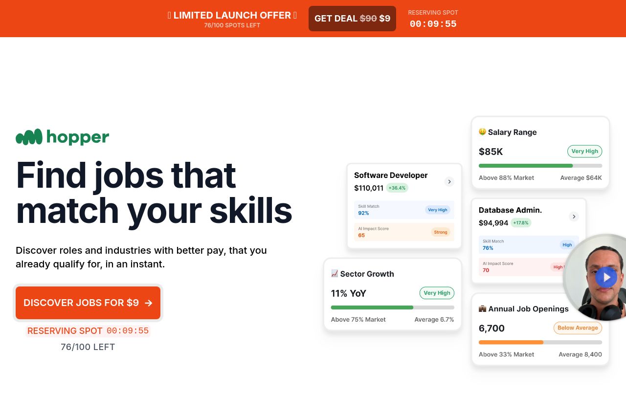
Hopper analyses your job AI Impact score, market positioning and skills to give you a clear step-by-step for promotion, pay or career changes.
Summary:
The landing page for Hopper is visually clean but feels somewhat cluttered due to the repetition of the same elements across sections, like the launch offer bar. The value proposition is clear but the urgency feels forced and distracting. The CTA is prominent but blends too well with the surrounding content, which can cause it to be overlooked. There's an overload of visual noise due to repeated elements and the same bright colors, reducing the impact of individual sections. Strong integration of social proof like testimonials and recognizable data sources adds credibility, yet the presentation and testimonials could be more engaging. The language used is straightforward, but lacks personality, making it hard to connect emotionally. The navigation flow is logical, but the headings aren’t distinct enough to be immediately informative. Overall, some structural refinement and a more nuanced design touch are needed to make the page more effective.
- Reduce the repetition of elements like the launch offer bar to avoid visual clutter.
- Enhance the distinction and prominence of CTAs to make them stand out.
- Improve the emotional appeal in language to better connect with users.
- Use varied color schemes to differentiate sections and improve visual hierarchy.
- Introduce dynamic elements in testimonials to increase engagement.