viralvisual.co
Landing Page Analysis
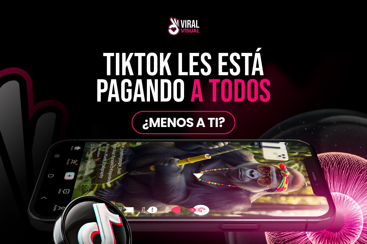
tiktok les estápagando a todos ¿menos a ti? ESTE PDF TE ENSEÑA activar el algoritmo Sin mostrar tu cara, sin editar, sin vender nada.Solo reproducciones.Monetización automática. Solo reproducciones.So
Summary:
Bold visual elements and catchy phrases like "¿Menos a ti?" create curiosity, but repetition of certain elements (like "Sólo reproducciones") feels overdone and potentially confusing. Vibrant color contrast grabs attention but risks overwhelming if not balanced properly. Reads as a bit gimmicky, which could undermine trust, especially with claims of automatic monetization and promises that seem too good to be true. The lack of a clear call to action with meaningful distinction may confuse users about what action to take. User testimonials support social proof but need more context or detail to build trust.
- Streamline the text to avoid repetition and enhance clarity.
- Improve CTA distinctiveness to guide users more clearly.
- Provide more context in testimonials to build credibility.