com.au
Landing Page Analysis
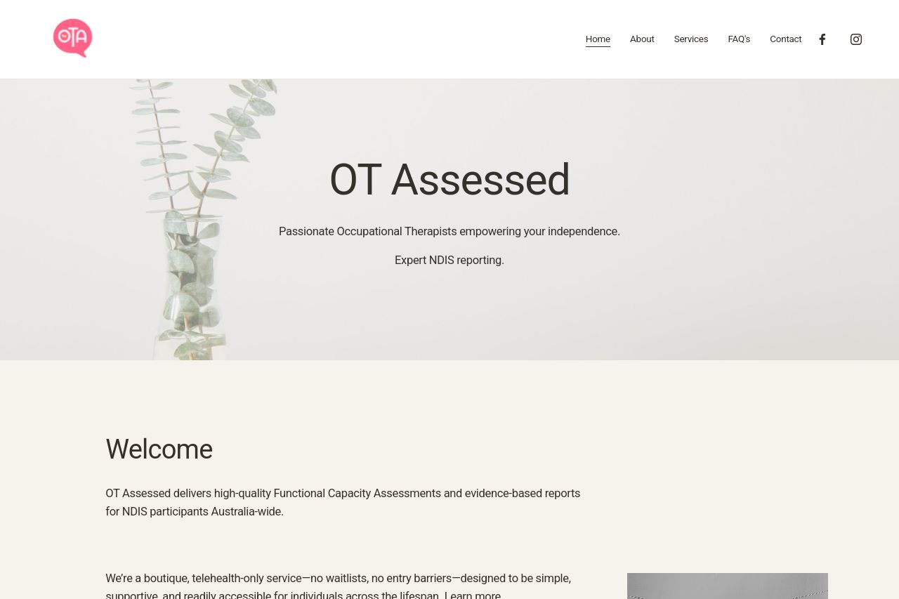
OT Assessed provides professional NDIS Functional Capacity Assessments and related reporting with no waitlists across Australia. Supporting participants to live independently and achieve their goals
Summary:
Overall, the landing page has a simplistic design that manages to convey its core offering without overwhelming the user. However, it suffers from key issues that undermine its effectiveness. The hero section lays down the main value proposition, but not in the most impactful way. This site caters to a niche audience, but the messaging could be sharper to target them. The readability is decent, yet the language could be simplified further, avoiding jargon and long sentences. Visually, the site feels a bit monotonous with a pastel color scheme that doesn't do much for visual hierarchy or grabbing immediate attention. Navigation through headings seems fairly straightforward, but could benefit from greater contrast. CTAs are present but not optimized for conversions or urgency. Social proof is almost non-existent—lacking testimonials or trust badges—and this harms credibility. The Open Graph data is straightforward yet uninspired, and doesn’t make you want to click. Improvement is definitely needed across several categories, notably in visual and textual enhancements to improve user engagement and trust.
- Enhance visual hierarchy by incorporating more vibrant and contrasting colors for key sections and CTAs.
- Add testimonials or case studies to improve social proof and credibility.
- Simplify language and break up long text blocks to improve readability.
- Make CTAs more action-oriented and ensure they stand out.
- Include trust badges or client logos to build trust.