hosted.app
Landing Page Analysis
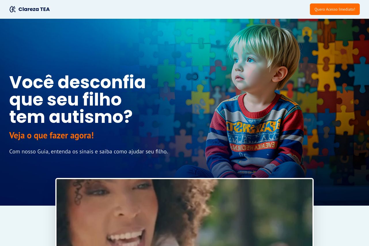
Entenda os sinais, saiba como agir e comece o acompanhamento hoje mesmo.
Summary:
Overall, the landing page for "Clareza TEA" has a strong focus on addressing parental concerns about autism, but there are areas for improvement.
The messaging is clear and aims to engage parents by defining the target audience and communicating the benefits of their guide. However, the value proposition could be highlighted more effectively, missing some clear use cases.
Readability is decent but could benefit from smaller, digestible chunks as some sentences are still a bit lengthy. The consistency in typography helps, though the layout becomes a bit tedious with similar formats repeated without hierarchy.
The design is cohesive but lacks a distinct visual hierarchy in some places, leading to a slightly cluttered look. The CTA buttons pop with their color scheme but feel a little overpowering.
In terms of structure, information flow is logical and somewhat intuitive, but some key information like pricing seems buried within the text.
The actionability section provides CTAs that are specific but could use a little more variance in placement, particularly post content where action naturally feels relevant.
Credibility is generally supported with testimonials and validation from professionals, but adding a few more well-known logos or partnerships could boost trust further.
- Highlight the main value proposition more clearly and provide specific previews or demos.
- Break down the text into smaller, more readable chunks and use varied formats to create hierarchy.
- Add more recognizable logos or partnerships to boost credibility and trust.
- Use varied CTA placements to enhance the user journey and engagement.