sanadisplay.com
Landing Page Analysis
Sana Display
70

Share on:
Summary:
60
Messaging
70
Readability
70
Structure
60
Actionability
70
Design
70
Credibility
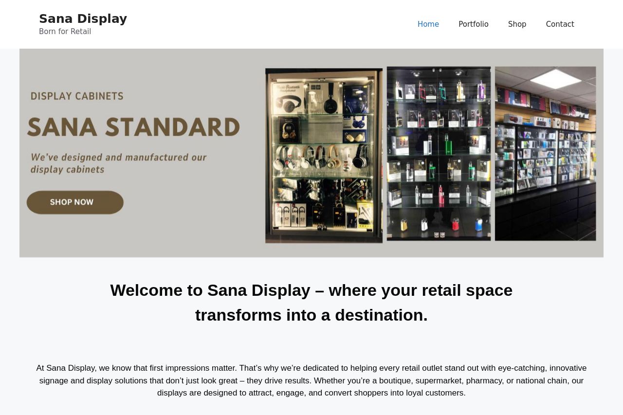
Sana Display's landing page gives a decent first impression with its professional and clean look, suitable for a B2B audience. The key messaging regarding transforming retail spaces is consistent and engaging. However, while the layout is generally easy to navigate, some sections feel text-heavy and could benefit from more concise and visually engaging content. The use of whitespace is effective, but typography and color choices, although not detrimental, are quite plain. Calls to action are present but don't stand out as much as they should, which may affect the actionability. Overall, it's a solid starting point but lacks some punch to drive conversions effectively.
Main Recommendations:
- Enhance the contrast and appeal of CTAs to make them more prominent.
- Use more engaging visuals or icons to break up text-heavy sections.
- Add more specific examples or case studies to highlight the effectiveness of the displays.