co.uk
Landing Page Analysis
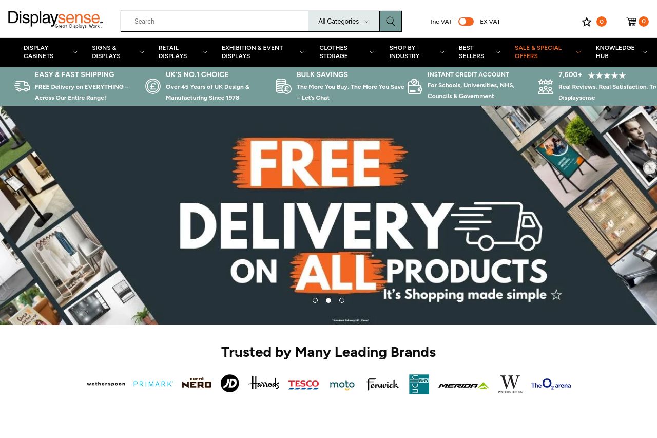
At Displaysense, we make Great Displays Work with our range of cutting-edge signs and displays, clothes rails, display cabinets and shelving. Next day delivery available.
Summary:
The landing page does a decent job showcasing the range of products with its images and well-organized sections. However, it suffers from several issues that need immediate attention. The design feels cluttered due to the overwhelming use of images, and the CTA buttons are weak. The messaging lacks a clear, engaging tone that truly speaks to the B2B audience, and while the text is mostly readable, the layout could use improvements for better flow and engagement. Credibility is strong thanks to visible trust elements and professional layout, but the tone needs sophistication to match the audience better. Overall, the page is functional but lacks intrigue and coherence that would make it stand out.
- Revamp the CTA design and text to be more engaging and distinctive.
- Simplify the layout to reduce visual clutter and improve readability.
- Enhance the messaging tone to better resonate with a B2B audience.