languagedove.com
Landing Page Analysis
Immerse yourself in a new language with interactive translations, contextual hints, and a seamless reading experience.
Summary:
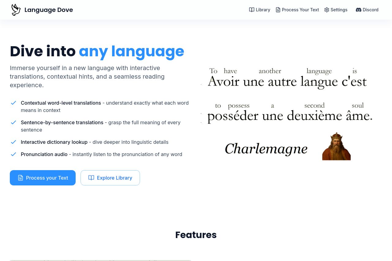
The Language Dove landing page is engaging but somewhat inconsistent in design and clarity. The hero section starts strong with a visually appealing layout and a clear call to action, but it lacks a strong initial impact with the value proposition not prominently highlighted. Colored text helps break monotony but might be overused in some areas, leading to distraction instead of emphasis. The content is articulate but could use more engaging headlines and simplified language to reach a broader audience effectively. The image of Charlemagne adds an interesting touch but seems somewhat irrelevant, which could confuse visitors.
The feature explanations are clear and concise, adequately guiding users through the product's offerings. However, there is a lot of technical jargon that might overwhelm novice users. The interface for "Interactive dictionary lookup" and "Sentence-by-sentence translation" is laid out well but could benefit from a more engaging design.
The presence of trust elements like a contact email and Discord link add credibility, yet the element of social proof like testimonials or recognizable logos is notably missing, which could affect confidence in the brand. The footer is straightforward but lacks more detailed company information that can reassure potential users.
- Highlight a stronger value proposition in the hero section.
- Increase the use of engaging imagery or icons related to language to enhance visual appeal.
- Introduce social proof elements like testimonials or logos of trusted partners.