yakstak.app
Landing Page Analysis
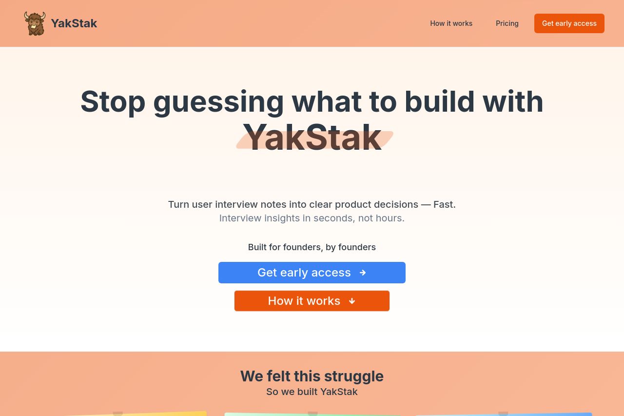
Stack your thoughts and insights with YakStak
77
Share on:
Summary:
75
Messaging
90
Readability
85
Structure
70
Actionability
80
Design
40
Credibility
Overall, YakStak's landing page does a decent job at communicating its value proposition but lacks some finesse and polish. The visual hierarchy is nearly effective with clear headings and a balanced typography, yet it still comes off as slightly bland. The messaging is straightforward but needs more personality to truly resonate with founders. Structurally, the order of information flows logically, but the design could benefit from more engaging visuals or dynamic elements. CTA's are also well-placed, but they don't pop enough to grab attention immediately. Enhancements in the design, tone, and content engagement would elevate the site's effectiveness significantly.
Main Recommendations:
- Enhance the visual style with more dynamic or engaging elements.
- Revise CTAs to make them more attention-grabbing.
- Incorporate more personalized and specific testimonials or trust signals.