com.au
Landing Page Analysis
0409 606 879
Summary:
The landing page for Active Strata Management is a mixed bag with room for improvement.
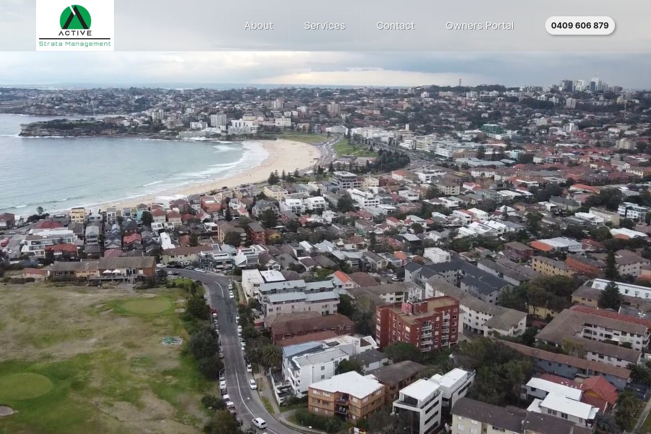
The value proposition is present but lacks precision. The text, while aiming to convey authority, feels somewhat generic. The design uses a bold green color scheme, which is visually distinctive but can be overwhelming and distracting. Typography is basic but effective; however, certain sections are cluttered by images, leading to a lack of focus and readability.
The imagery feels excessive and doesn't significantly add to the understanding of the services offered. The navigation is straightforward, but the headings could be more distinctive to enhance the browsing experience. CTAs like “Get a Quote” and “Contact Us” are appropriately actionable but seem to blend into the background due to insufficient contrast.
Social proof and credibility indicators are nearly non-existent, apart from some contact information, which are buried in the footer. The content lacks urgency and fails to guide the user compellingly towards action, affecting overall engagement and conversion potential.
- Enhance the value proposition by specifying unique selling points and clear benefits.
- Reduce the number of images and focus on those that add value or relevancy.
- Increase the contrast and prominence of CTAs to guide user actions more effectively.
- Add testimonials, reviews, or client logos to establish trust and credibility.
- Improve section headings for better navigation and readability.